The co-design process helps us meet our audience where they are.
Whether we're co-designing data visualisations to convey scientific findings, transforming scientific reports into engaging experiences, collaborating in large research projects across different work packages, or conducting hands-on workshops, we see Design as a strategic problem-solving process. Design enhances our understanding of any content by allowing us to map out interconnections, facilitate dialogues among scientists, build bridges between data experts and the audience, and involve key stakeholders.
Data visualisations are more than just tools; they enhance understanding throughout the research process and are crucial when it comes time to communicate the findings.
Creating scientifically rigorous and user-friendly data visualisations can play a critical role in making complex information more accessible to wider audiences, in supporting scientists during their research process and empowering people to make informed decisions.
For data visualisations to be effective sense-making and decision-making tools that help us discern, distinguish, learn and understand, the design and production processes are not trivial. Increasingly, research insights from the fields of design, cognition, psychology and behavioural economics, as well as the increasing robustness of human-centred and participatory design methodologies, can guide us in designing data visualisations that enhance understanding, empower the final users and support informed decision-making at all levels.
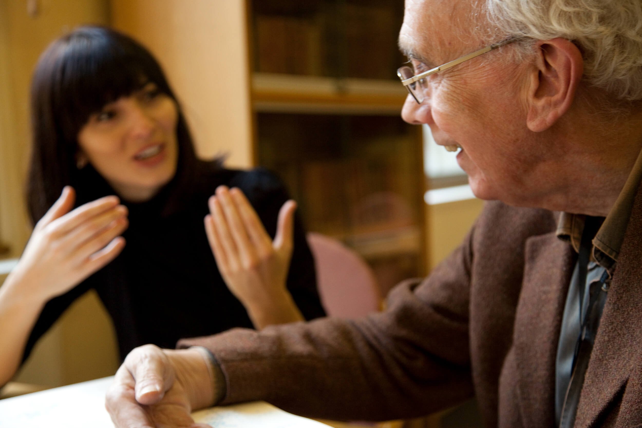
The importance of co-design in visualising science
Co-design encapsulates a way of approaching data visualisation that ensures a deep and shared understanding between those creating the visuals (e.g. information designers, content experts, cognitive scientists) and the audience.
We are proud to have collaborated with a number of high-profile clients on a range of multi-disciplinary projects covering climate science, sustainable development and public health. The projects might vary in terms of magnitude and number of actors involved, but they all have a common denominator, the co-design process.
Why is co-design so important when it comes to the visualisation (and more broadly communication) of scientific findings? Because co-designing data visualisations with the readers and above all with the content experts helps us meet our audience where they are.
Co-design is centered on the involvement of all those who affect and are affected by the consequences of design, and exactly that involvement can be the centre of ripples that last.
Over nearly two decades of projects, we've come to realize that it's not just what we design, but how we design it that can leave a lasting mark on our audience's experience and the journey of all stakeholders involved in the process. That involvement is what we really care about and we have built tools to foster it.
Together, we explore and stress-test solutions, achieving a sense of joint ownership of the final product.
A participatory journey in designing science
Our goal is to empower an audience to see patterns. If the ambition is turning data into information, presenting it in a way that becomes knowledge in the mind of the users, hopefully help make important decisions and, ultimately, inspire change, for us learning how our audience will decode the information and understanding the context in which the information will be processed are key insights that guide the design.
On the other side we have the authors of the data and the scientists. Listening to their needs and ideas is crucial, diving into the content with their guidance helps us build a deep and shared understanding of the nature of their data and the science that underpins it, as well as the assumptions, uncertainties, caveats, connections and challenges associated with it.
From our extensive experience working closely with the science community, we have found the co-design and user-involvement approach is the only route to collective success when it comes to turning complex scientific data into effective visual tools for decision-making.
Leadership and dedicated support is important for making sure the co-design process is positively accepted by the stakeholders involved in the process and for ensuring its smooth running.
The legacy of such a way of working does not consist only in design deliverables and effective visualisations, but also in cultural changes and mind shifts within the organisations we collaborate with.

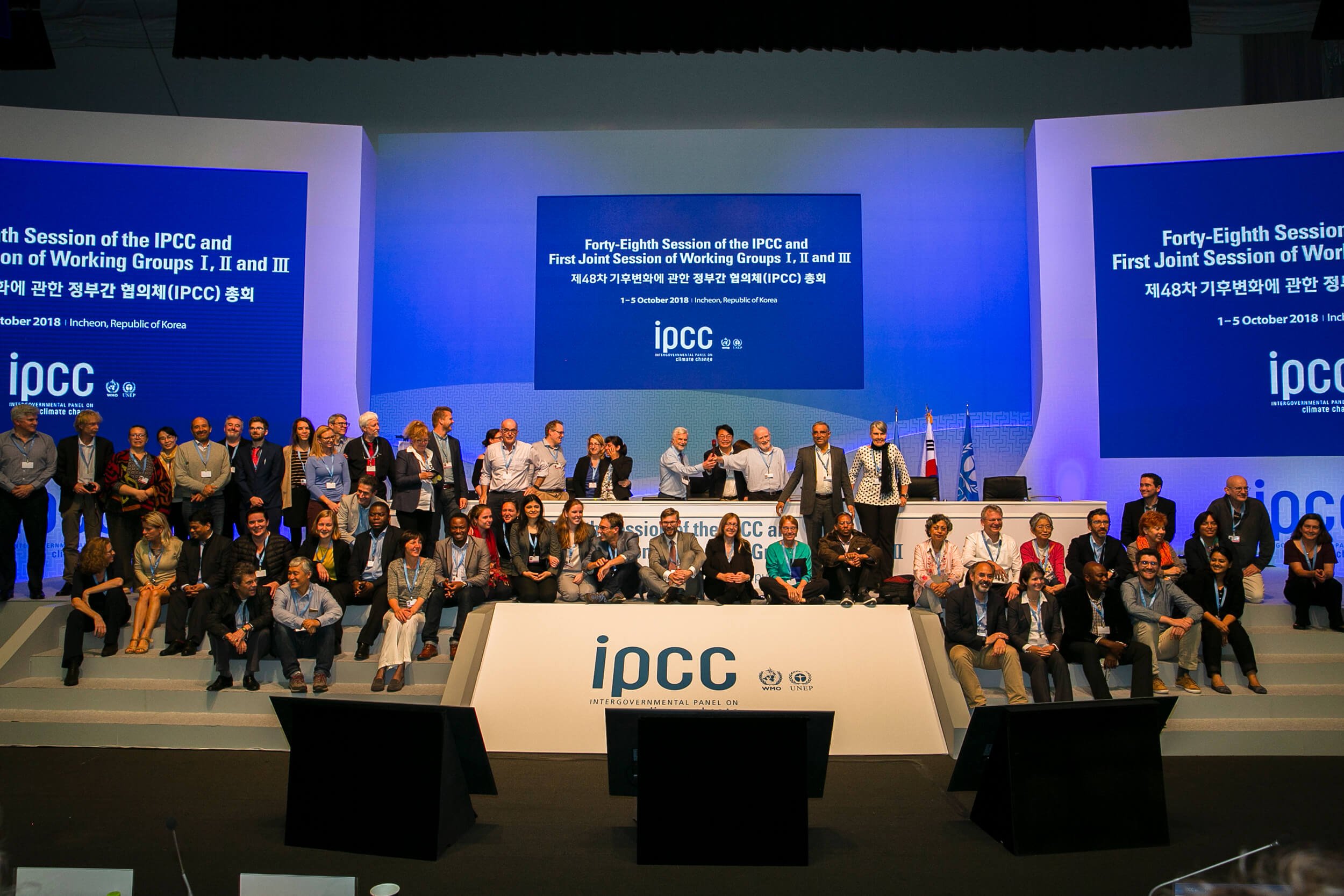
The expedition to Greenland: understanding the impact of climate change
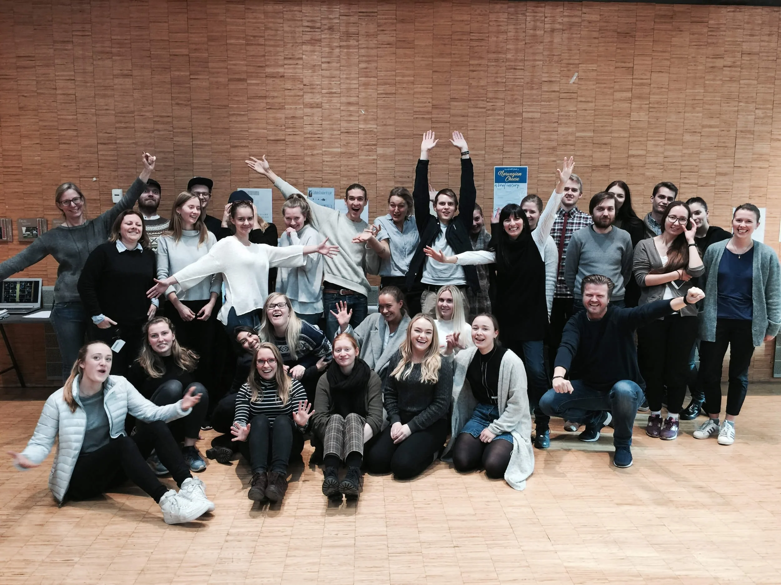
At the Oslo University of Architecture and Design: sharing tools to co-design
A systemic approach
The way we work at InfoDesignLab has its foundation in three disciplines: Information Design, Design Thinking, and System Thinking.
Information Design is the organisation and presentation of data in a way that transforms it into valuable, understandable information. Through Information Design, we can turn complex information into meaningful visuals, empower audiences and spark change. The tools we use range from color to typography, from cognitive science to universal design, from in-depth interviews to user testing, from static to interactive images.
Design Thinking is about creative problem solving. It is a path to innovation that puts human needs at the centre of all we do. Taking this mindset ensures we create something that resonates with people, is desirable, feasible to produce and makes good business sense.
Systems thinking focuses on how different parts of a system interrelate, how systems change over time and how they fit within the context of larger systems. Systems Thinking allows us to gain a deep understanding of the context and the actors, painting a complex and rich picture.
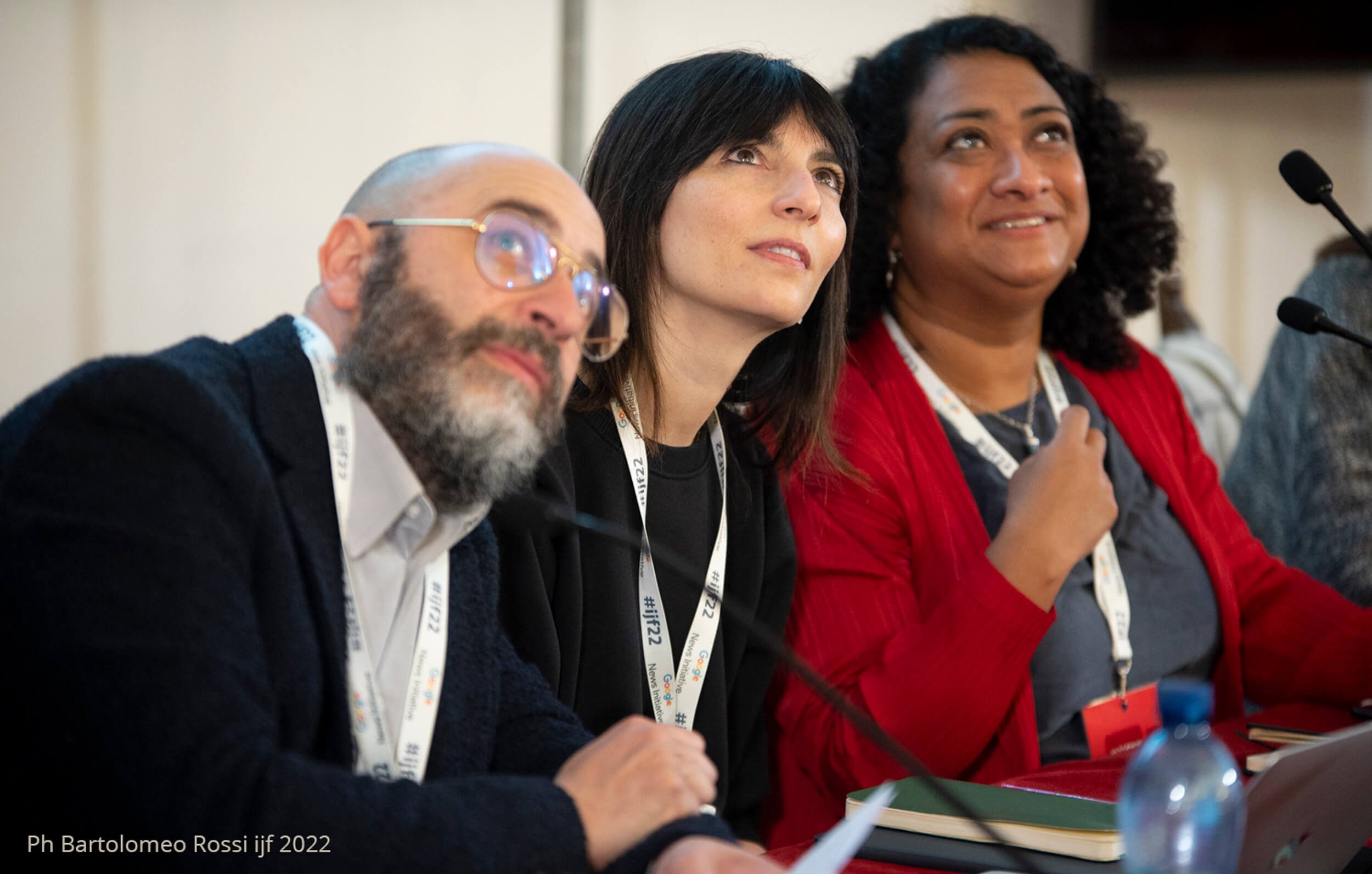
At the International Journalism Festival: Narratives of Climate Change

At the Oslo Centre for Design and Architecture: Masterclass in Data Visualization
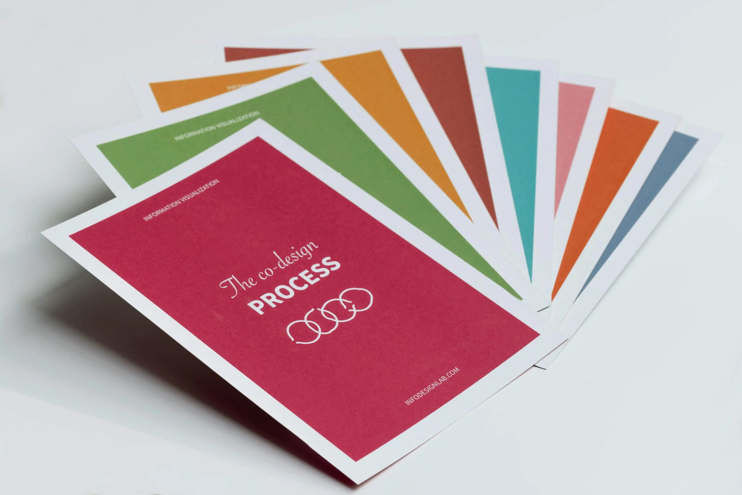
The skeleton of the co-design process
A neat diagram illustrating the co-design process might not easily capture the twists and turns that we need to be equipped to face along the journey! Over the years we have built effective facilitation tools to ensure the participation of users, scientists, designers, and a large number of stakeholders, this allows us and our clients to own the process, to monitor progress and to adjust to unexpected changes.
We plan the process to create maximum space for sharing, for conversations and feedback. Merging ideas across different parts of the globe, time-zones and schedules, we listen, we learn and we design, until we have co-designed something together that fulfils the initial challenge as well as is scientifically rigorous.
Our co-design process is based on iterations, each with three cycles A, B, C (though the number is not set in stone). In each cycle, there is a sequence of design meetings, design work and user involvement. The rhythm is defined in line with content experts’ availability and stakeholders’ needs involved in the design process, ensuring maximum flexibility to meet evolving needs of the projects we work on.
Cycle A: After an initial period of research during which we dig into the content at the heart of the project studying the science and the data, we begin with Design Meetings A with the scientists and internal project team. Here, we discuss the content and data, ask as many questions as possible and work with the scientists on the narrative structure. The period of Design Work A ends with a first iteration of sketches.
Cycle B: At Design Meetings B, we discuss the first iteration of sketches, gather feedback from scientists and the project team, gather new inputs and define action points. In Design Work B we make the changes and develop a new iteration of sketches.
Cycle C: Finally, Cycle C begins with another set of Design Meetings C to discuss the new versions and identify any remaining challenges and/or potential changes. In Design work C we make final changes, then we have the end product.

The importance of mastering the content
You can only design information effectively if you master the content. As information designers, we achieve that by a constant dialogue with the content experts, by researching the content and asking the right questions to identify the right challenges. Our experience in dealing with big data, our knowledge of scientific processes, our passion for numbers and statistics, our care for quantitative and qualitative information and, above all, an understanding of the barriers that can prevent users from making sense of complex information guide us our decisions during the design process. It is vital to design information not only in a way that is clear, but also in a way that strikes the right note in the mind of the viewer.

The technical know-how
Information design lies at the intersection of beauty and function, text and image, perception and cognition, logic and emotion, enabling us to reveal what hides behind our data and to address effective messages. The combination of analytical, technological and design skills is crucial to deliver innovative, beautiful and powerful solutions. Beauty and engagement are a fundamental component of designing understanding.

The type of projects we work on
Our commissions can consist of:
turning complex scientific reports into experiences that enhance understanding and engagement;
visualising complex data by defining the appropriate visual narrative that meets the needs of an audience;
using information design and data visualisation to help clients identify effective solutions to complex challenges;
turning research papers into visual stories that become usable for the general public;
creating data visualisation for research proposals, with the goal of communicating with clarity and beauty the vision and goals behind a research application
working with scientists with large research projects across various work packages and collaborating with communication teams to help them define content for dissemination
designing beautiful and engaging visual identities for scientific projects (including brand identity and visual style guide for the data visualisations).
Read more about the co-design process:
Springer Nature, in the paper Co-designing engaging and accessible data visualisations: a case study of the IPCC reports, as part of a collection called Climate Change Communication and the IPCC
Nightingale, Communicating Climate Risk: Insights from the IPCC Information Design Team
Podcast Data Stories, Visualizing Global Warming with IPCC with Angela Morelli and Tom Gabriel Johansen
The Lancet, in the context of The Informed Health Choices project: