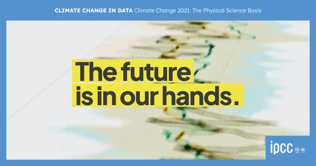
Climate Change in Data
A layered digital narrative to present and understand the key visualisations of The Physical Science Basis report, the IPCC Working Group I contribution to the 6th assessment cycle.

Climate Change in Data represents a collaboration between InfoDesignLab, the IPCC Working Group I Technical Support Unit (TSU) and the Norwegian Environment Agency (NEA). The goal of the project was to co-create an engaging digital experience that would guide readers through the scientific findings of The Physical Science Basis, the Working Group I contribution to the 6th Assessment Cycle.
The background
Being the information designers responsible for the visualisations of three summaries for policymakers for the IPCC has been a defining journey for us professionally. The acronym IPCC stands for Intergovernmental Panel on Climate Change, and it provides the benchmark in scientific understanding of climate change. The reports are drafted by scientists over many months, years even. They are unique in going through several rounds of review and feedback by experts and governments worldwide.
The Physical Science Basis is the IPCC Working Group I contribution to the 6th assessment cycle and was approved in August 2021. It was an incredible undertaking considering that:
234 authors from 65 countries in total were involved in the assessment and writing of the report
authors reviewed a massive body of scientific work, the report has 14,000 cited references to the scientific literature
in this report across 3 drafts 78007 review comments have been received from experts and from countries with different needs and perspectives
more than 1300 comments were only for the visualisations and the comments have to be addressed one by one
3.3 million is the estimated number of people who shared or got engaged with the content in the first weeks after the launch.
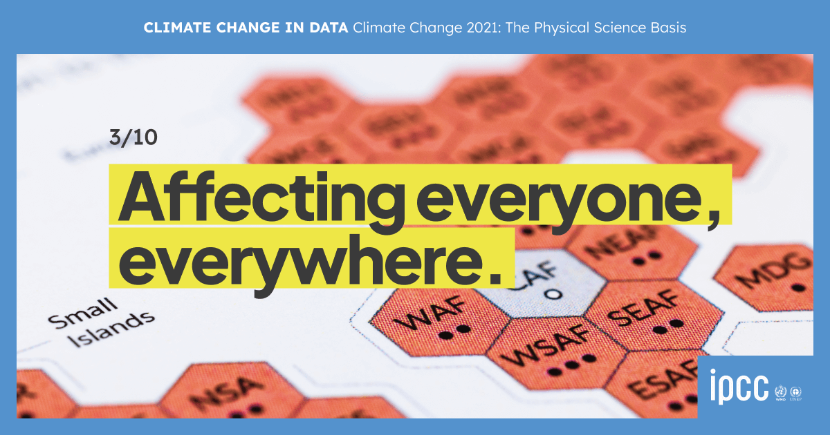
The expectations for these reports are usually incredibly high and with such high public interest in climate change around the world, the global audience for the Physical Science Basis has been extremely broad, including sector-specific experts, journalists, general public, policymakers, NGOs, activists and school children.
Tailoring the visualisations we co-designed for the Summary for Policymakers (SPM) into visual formats that resonate with specific target audiences was a huge and unmissable opportunity to engage more people than ever with climate science and the work of the IPCC.

The co-design process
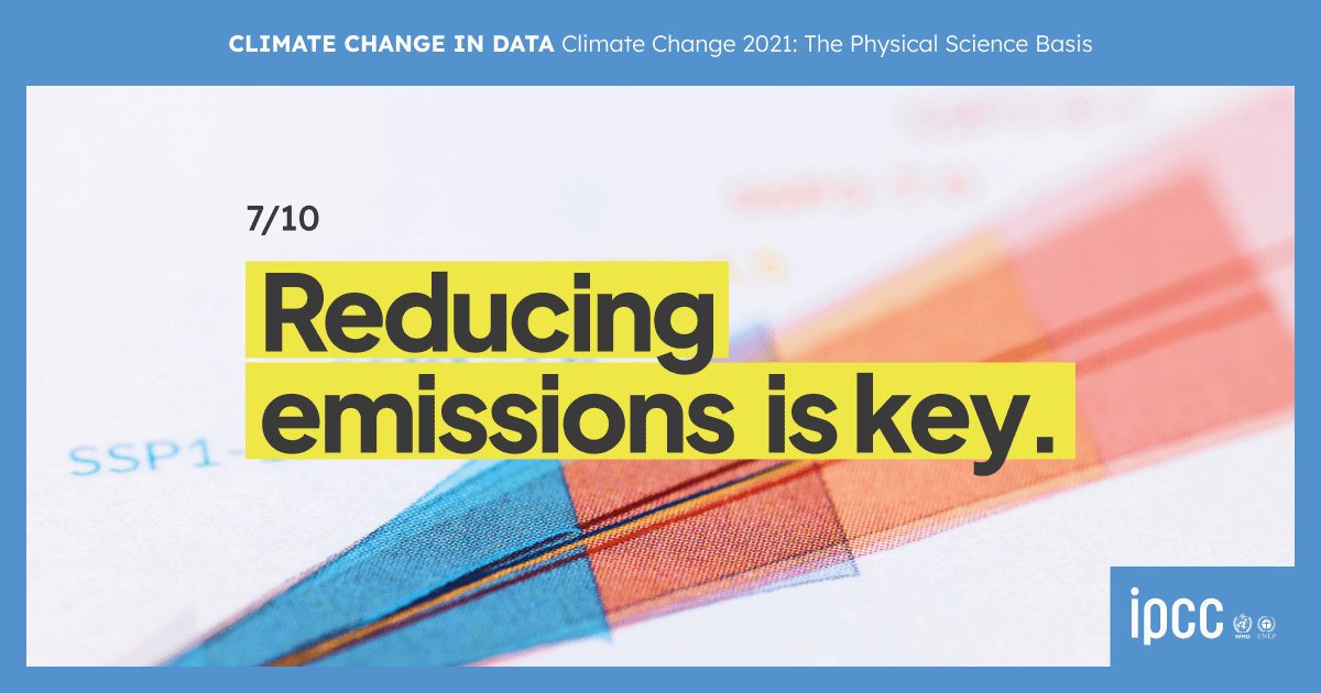
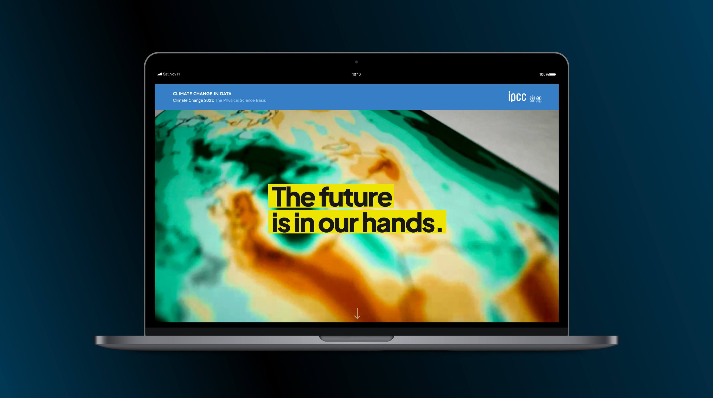
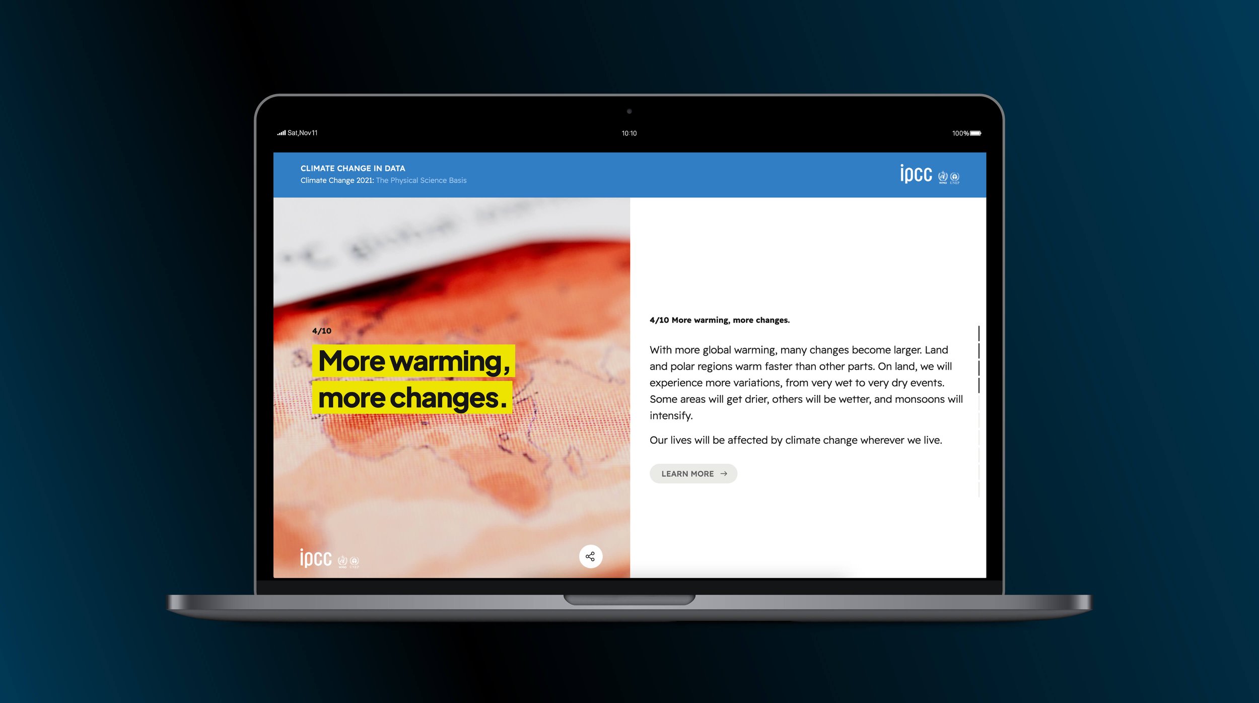
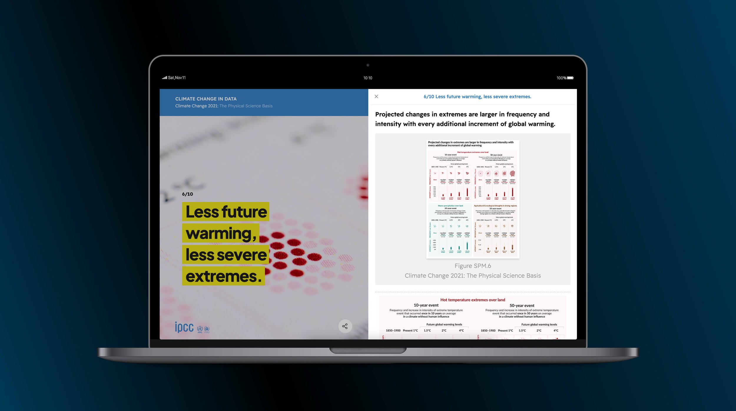
We facilitated the co-design process over a period of 8 months. The ambition was to co-design an outreach product to support non-expert users in navigating and understanding the key messages of 10 core visualisations and support authors in using the visuals for outreach. The goals were:
to design a visual storyline to communicate the key messages of the SPM figures effectively to non-specialist audiences via a web-based platform,
to co-design powerpoint presentations that would enable specialists and non-specialists to explain the visuals
to support the IPCC team in the preparation of video material.
The co-design process involved the experience and knowledge of many professionals: scientists, information designers, professional science editors, science communicators, a photographer and a film maker, a team of UX/UI designers and developers.
The creative process to develop a visual identity in line with the IPCC existing identity and to achieve a plain-langue, yet accurate haiku-style narrative has presented us with challenges, but many opportunities. The rigour implemented to co-design the product to take into account each participants’ requirements ensured a fully accurate product. Improving and developing such a novel material thanks to learning from others that have different expertise would not have been possible without co-design.