The visualisations for the IPCC reports
The IPCC reports are for the world’s policymakers and provide the benchmark in scientific understanding of climate change. They are drafted by scientists over many months or years. The summaries for policymakers of these reports are where the interface between science and policy happens. Being the information designers responsible for the visualisations of three summaries for policymakers for the IPCC has been a defining journey for us professionally.

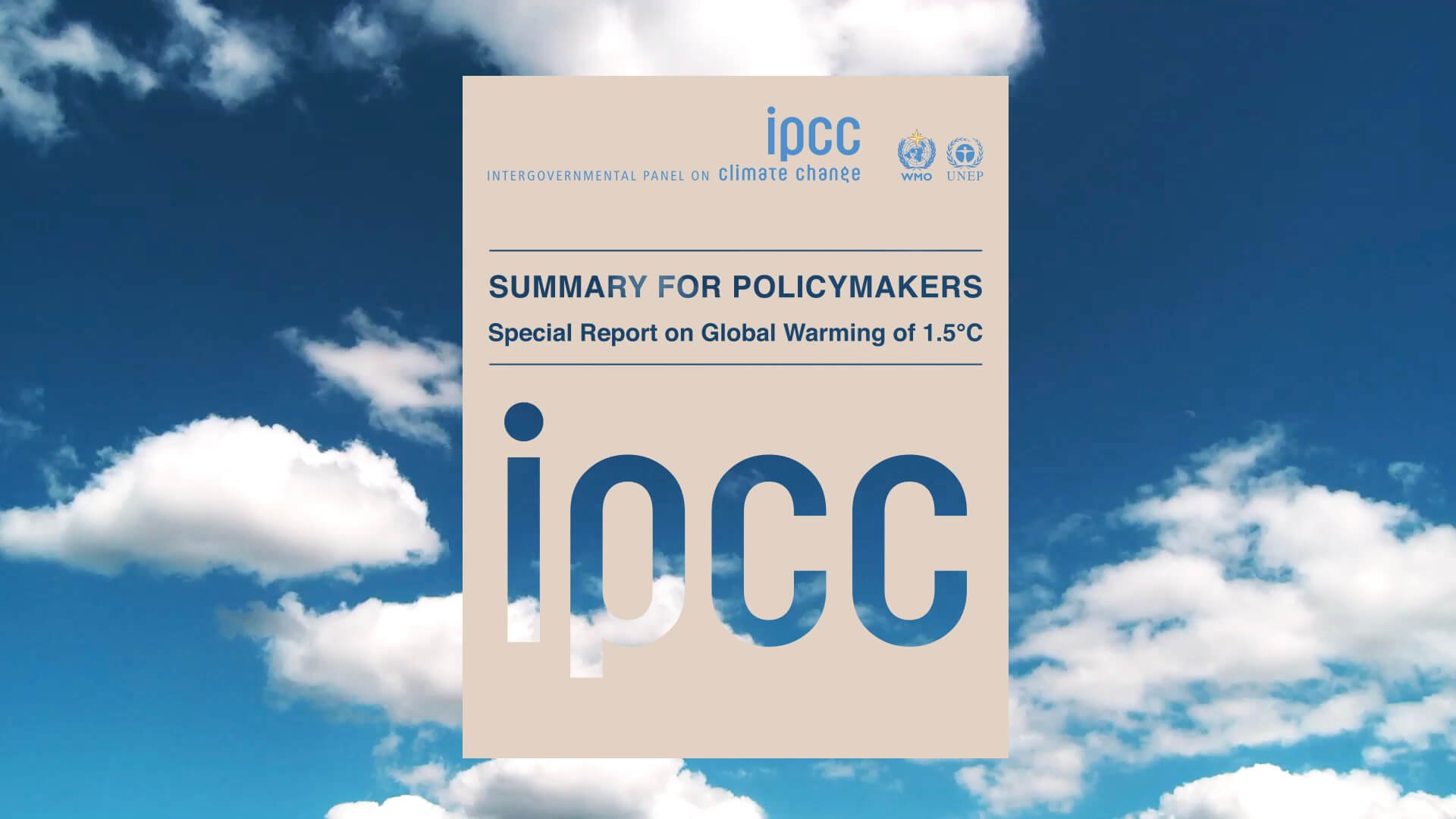
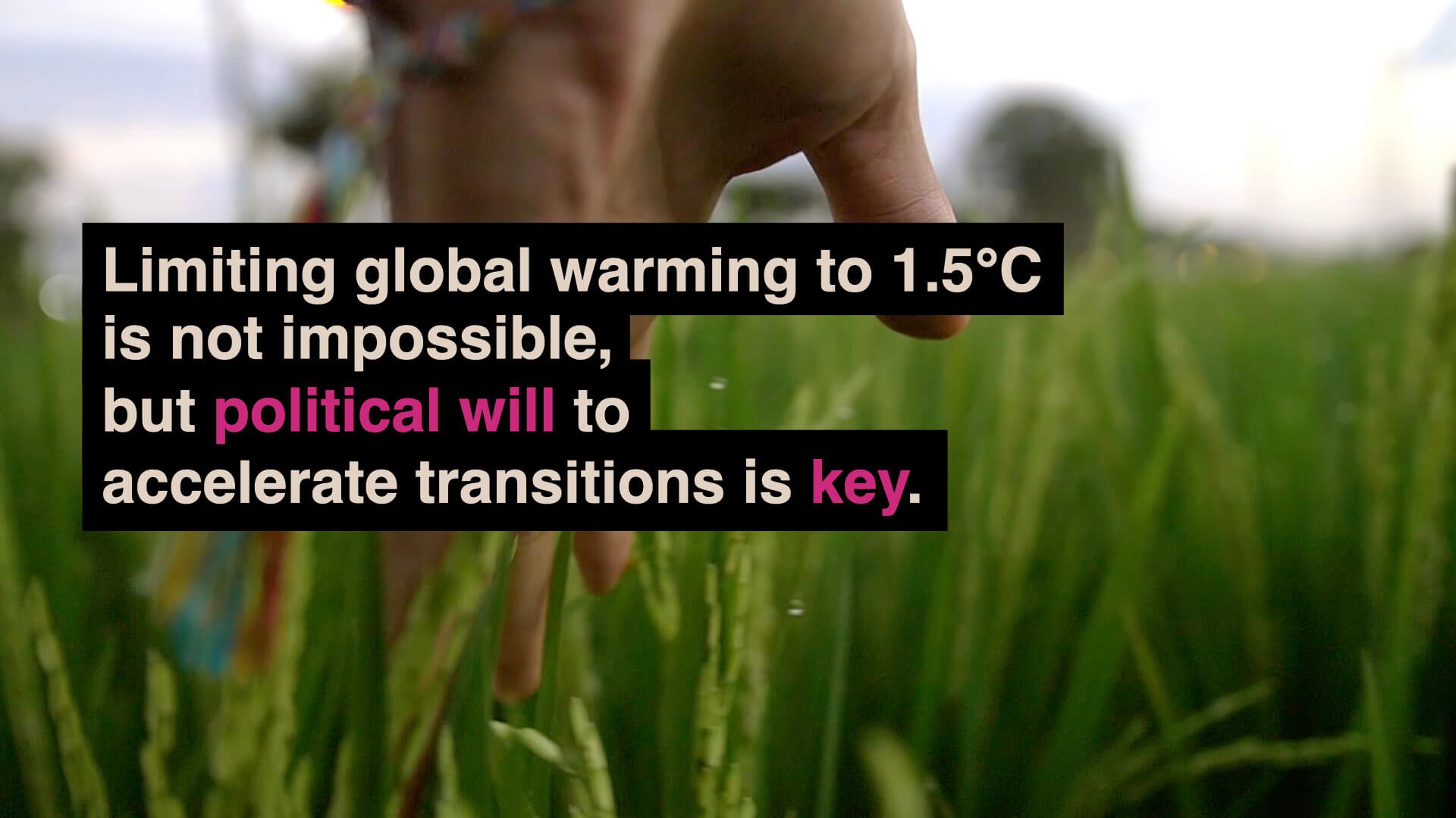
1. The IPCC Special Report on Global Warming of 1.5°C
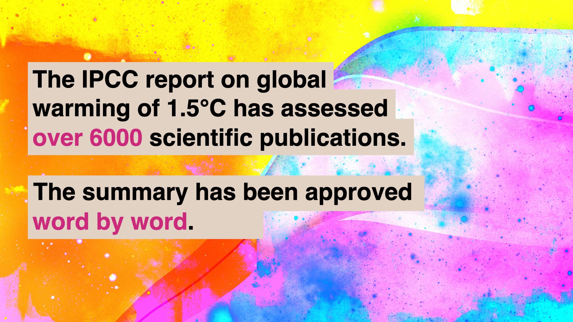
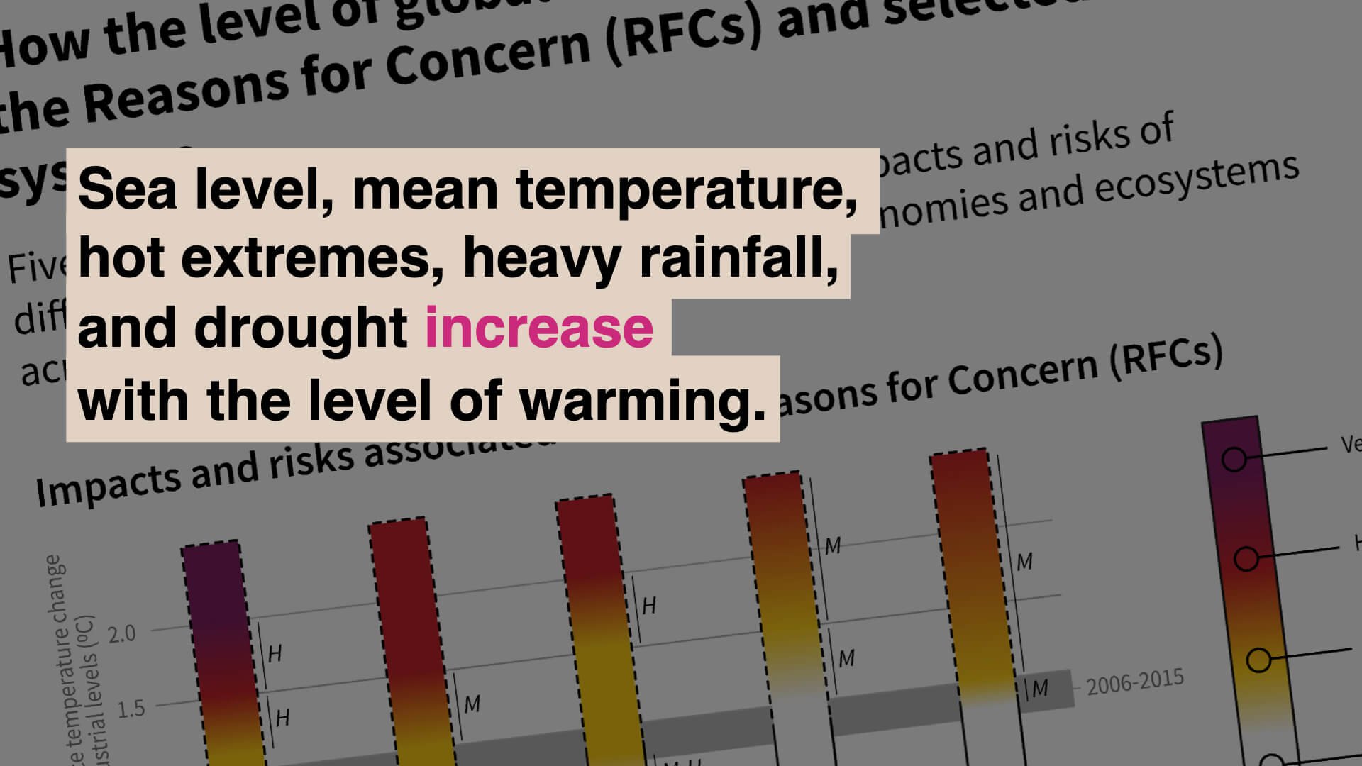
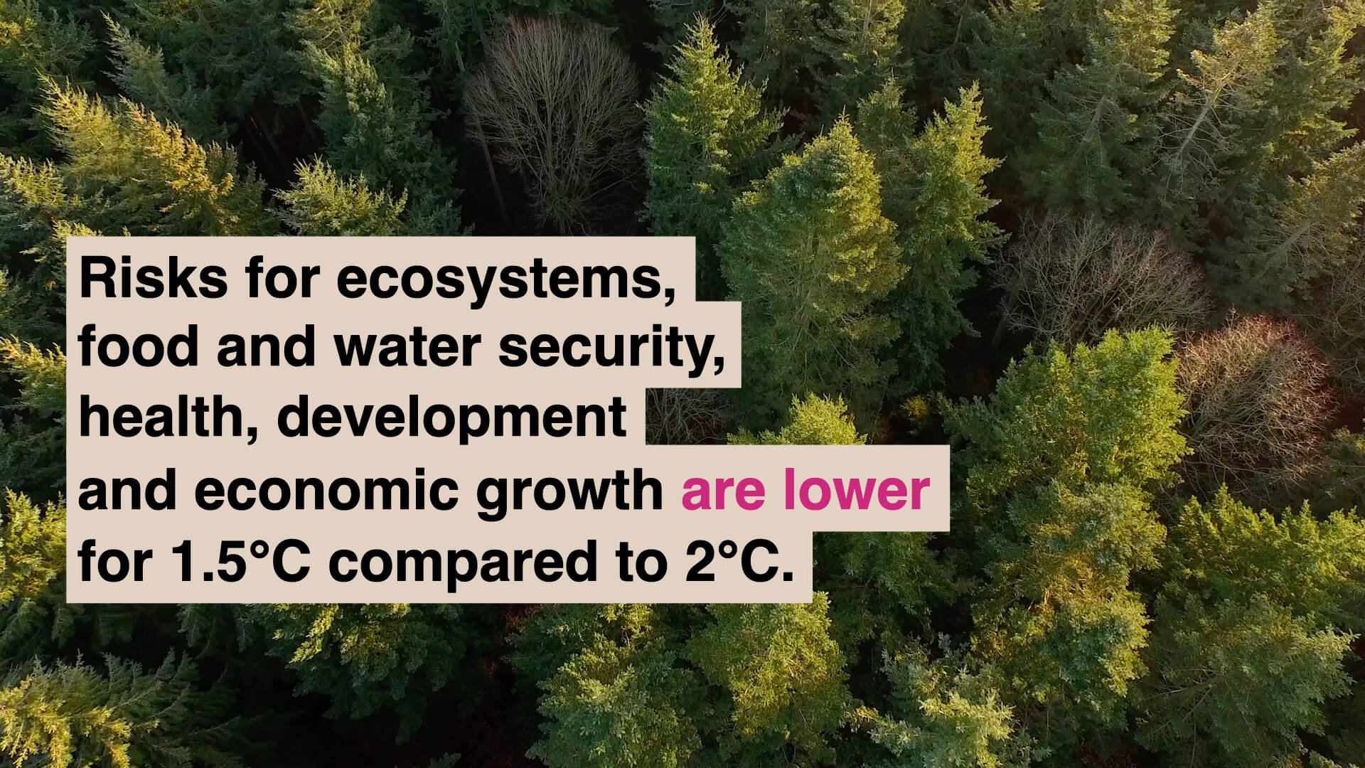
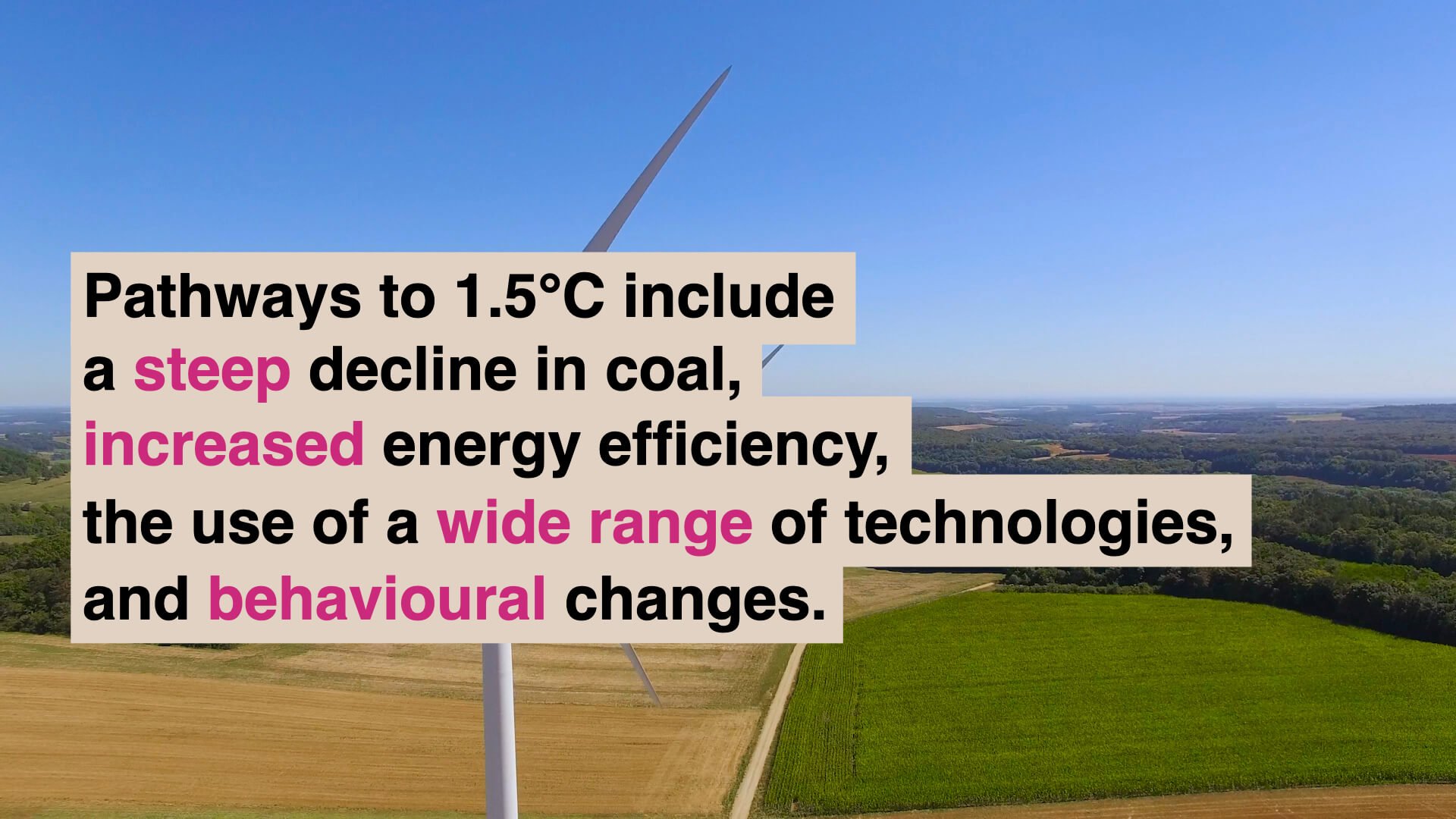
The IPCC’s assessment reports have been instrumental in shaping international climate policy. Perhaps the most high-profile in its 30-year history to date is the Special Report on Global Warming of 1.5°C (SR15). With a huge and diverse audience of scientists, policymakers, journalists, the public and stakeholders from the business, industry, finance and education sectors, the challenging brief was to produce a set of engaging and informative figures for the Summary for Policymakers, the most widely read part of the report.
Working closely with the scientist authors, the WGI Technical Support Unit (TSU) and all six Working Group Co-Chairs over several months, InfoDesignLab helped to bring a fresh approach to visual communication to the IPCC reports.
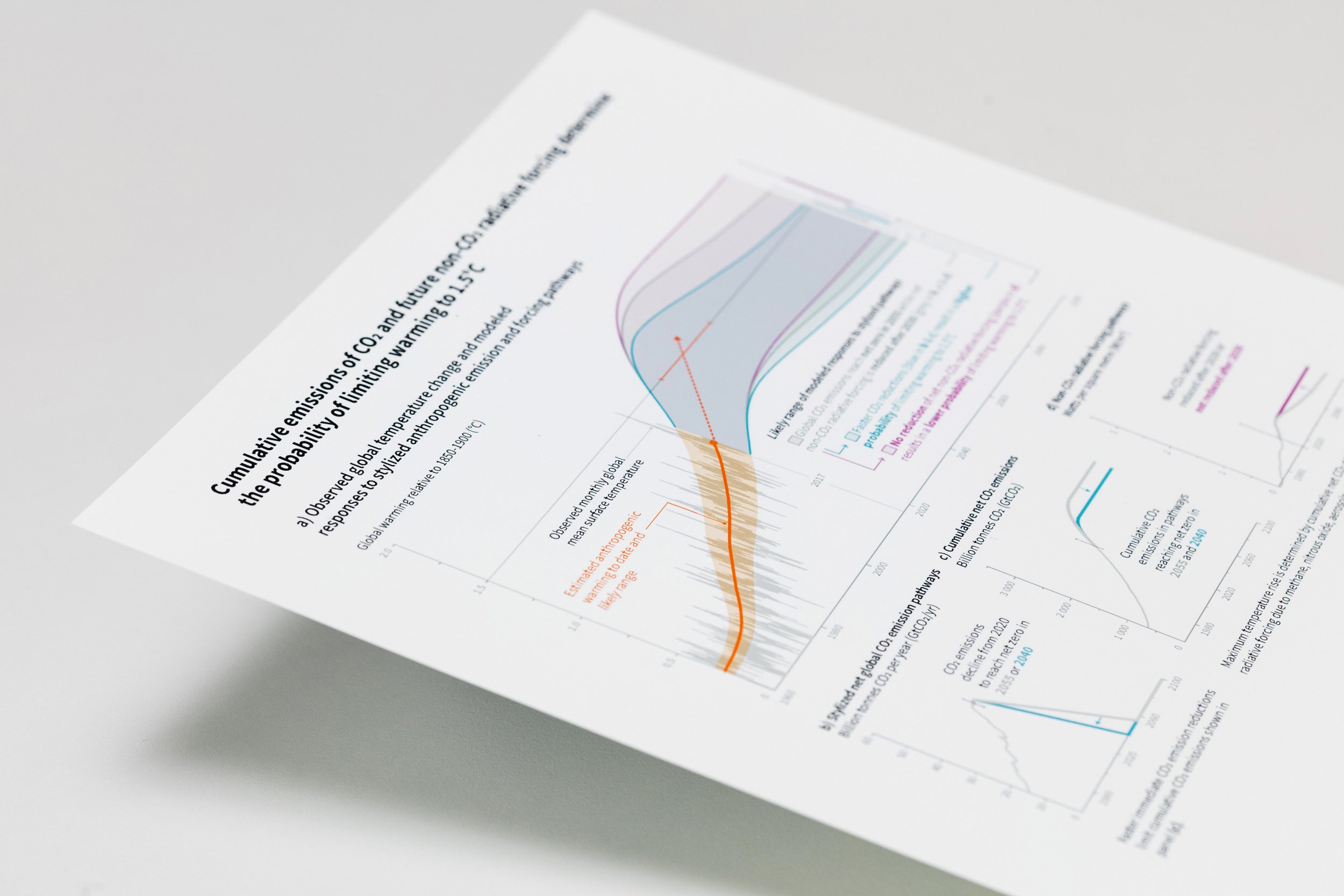

Our specific deliverables for the Special Report on 1.5°C included: co-designing five key SPM figures; real-time editing at the approval session in October 2018; and delivery of the approved visuals in formats appropriate for online, download and public outreach purposes. We are grateful to the Working Group I Technical Support Unit for formally acknowledging InfoDesignLab’s contribution by listing us as drafting authors of the final SPM.
With an acute appreciation for the timescales and pressures under which the authors were working, InfoDesignLab’s co-design approach maximised efficiency while ensuring the authors maintained complete ownership and oversight over the evolving figures at all times. Elements of the co-design process included: design meetings (in-person and remote); guiding authors to think about key messages, audience, narrative, objectives and challenges; incorporating internal feedback and formal review comments in a series of iterations; agreeing work plans with authors; keeping constant lines of communication to review progress and discuss next steps.
The design process for the Special Report on 1.5°C involved a user testing phase carried out by the Tyndall Centre in the UK with IPCC leadership, authors, TSU and focal points at the 47th session of the IPCC in March 2018. Coming at a critical time in the design process, these insights provided a valuable evidence base for the evolving figures.


As part of the project outputs, InfoDesignLab produced a trailer presented at COP24 in Katowice, Poland, outlining the main messages of the SPM figures and the report as a whole. Separately, InfoDesignLab produced the graphics for an explainer issued by the World Meteorological Organisation (WMO) and United Nations Environment Programme (UNEP), which provided context and explanations for key concepts underpinning the Special Report. In this article Designing for Tuesday we explain more about how we work and our experience being part of the most important climate report of the 21st century.
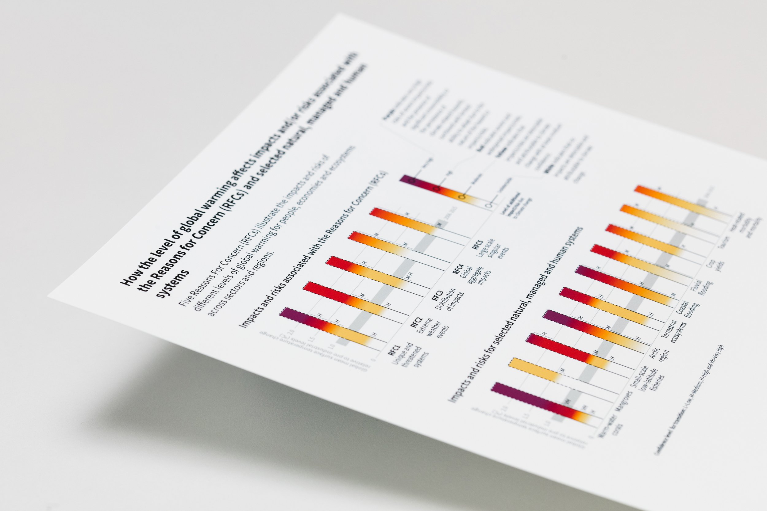
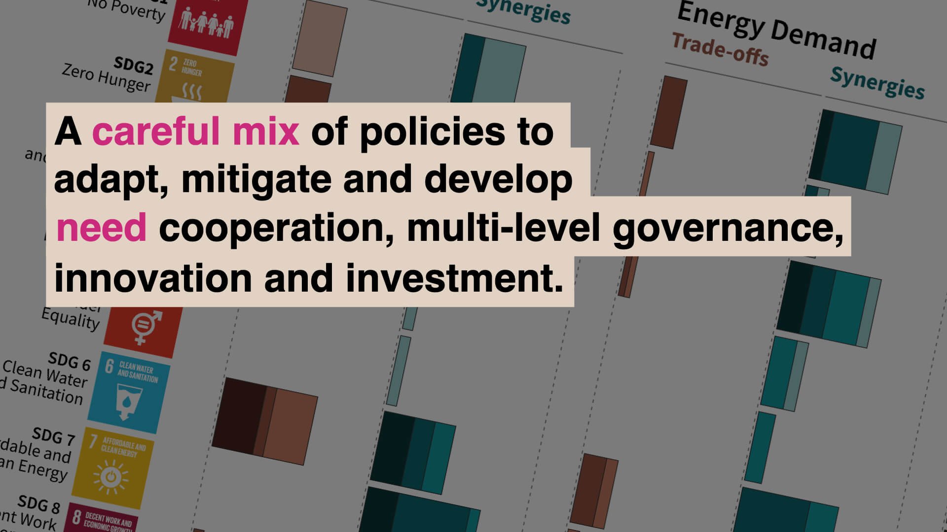
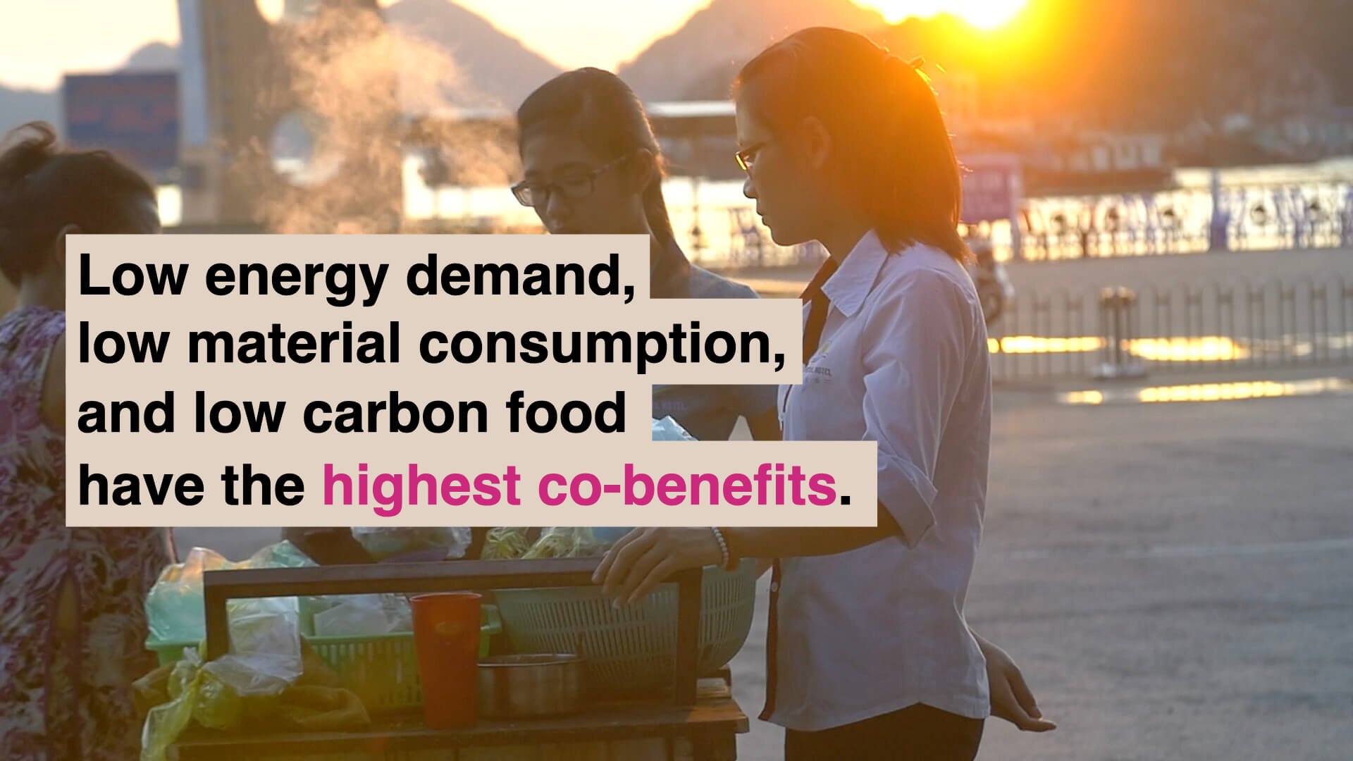
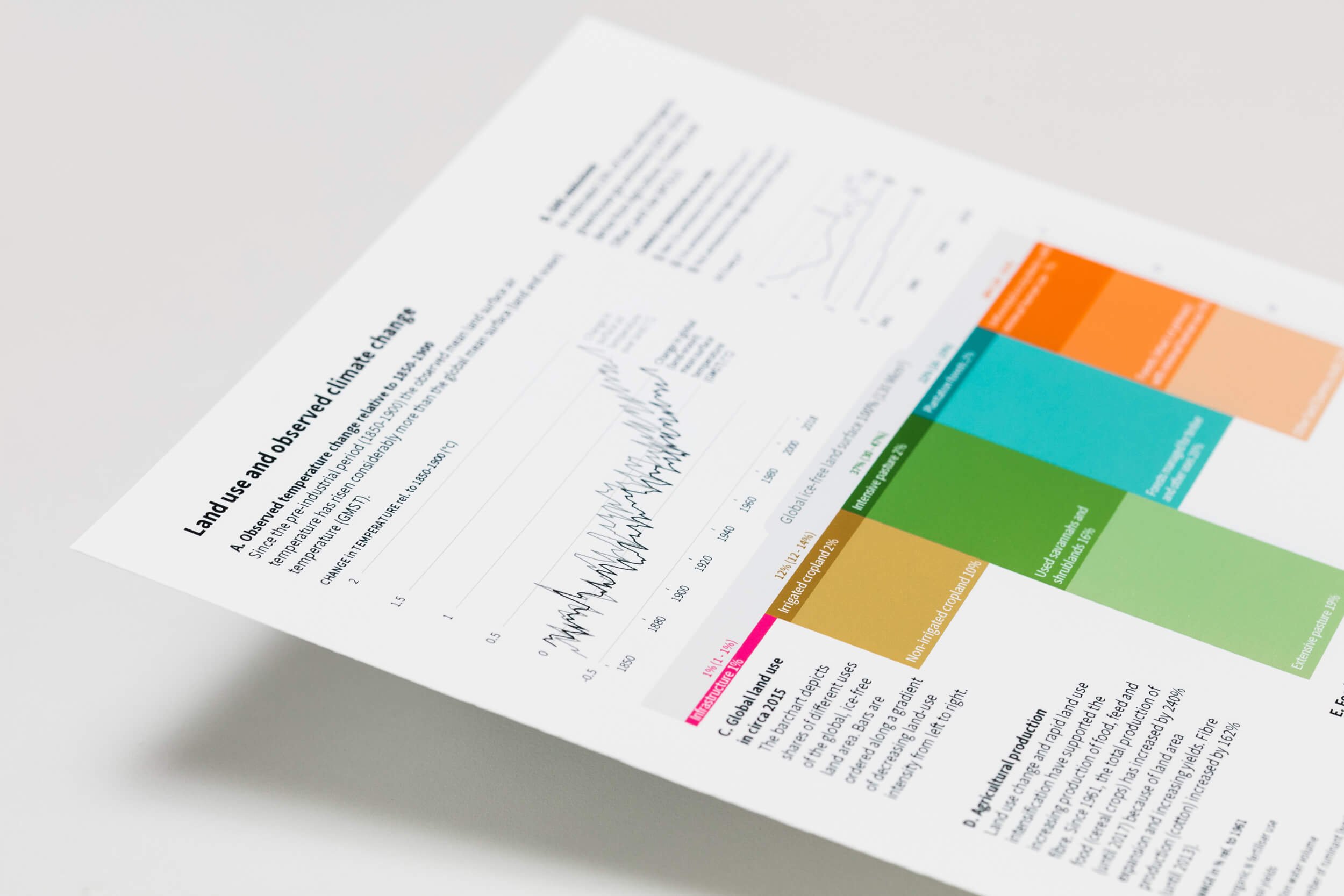
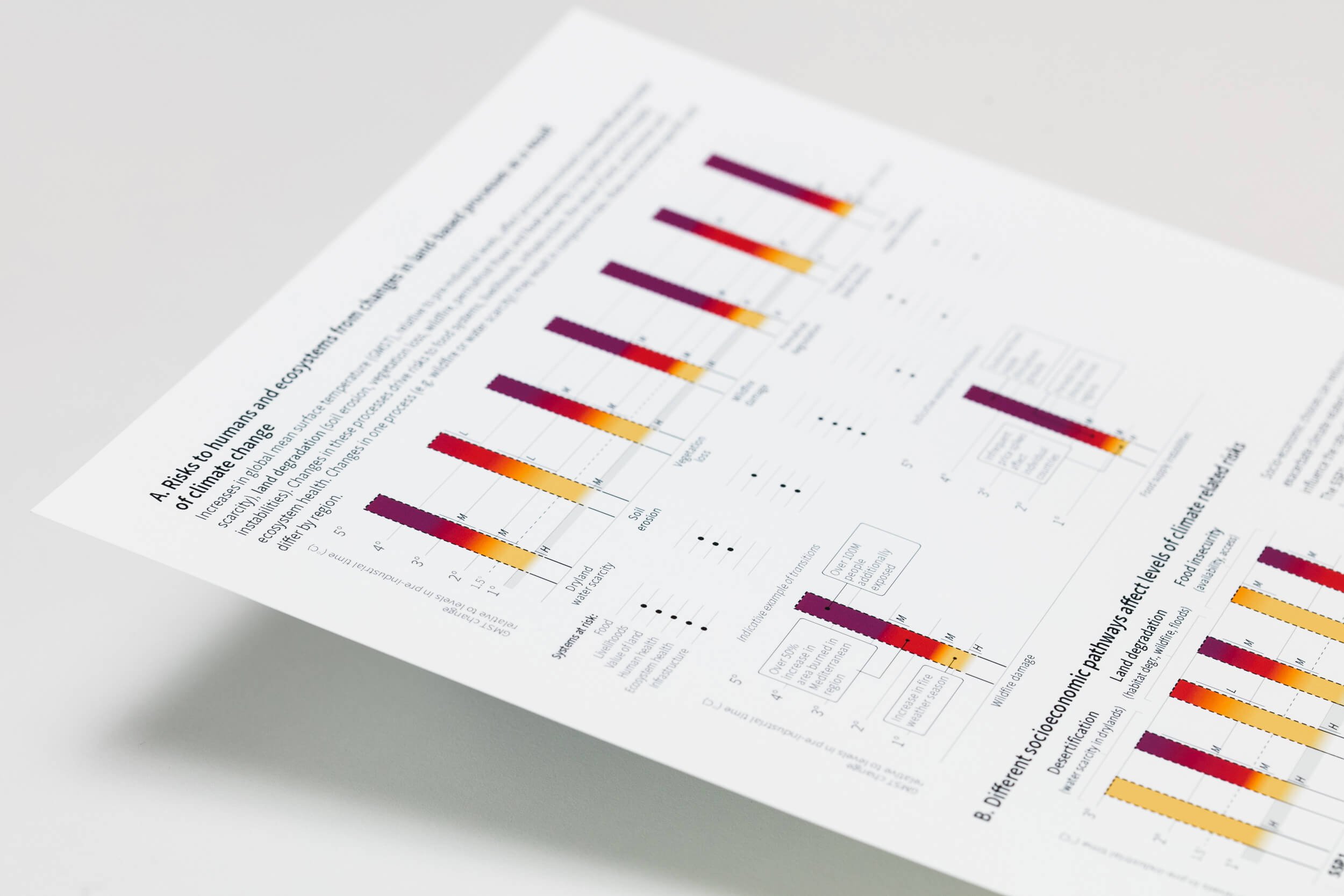
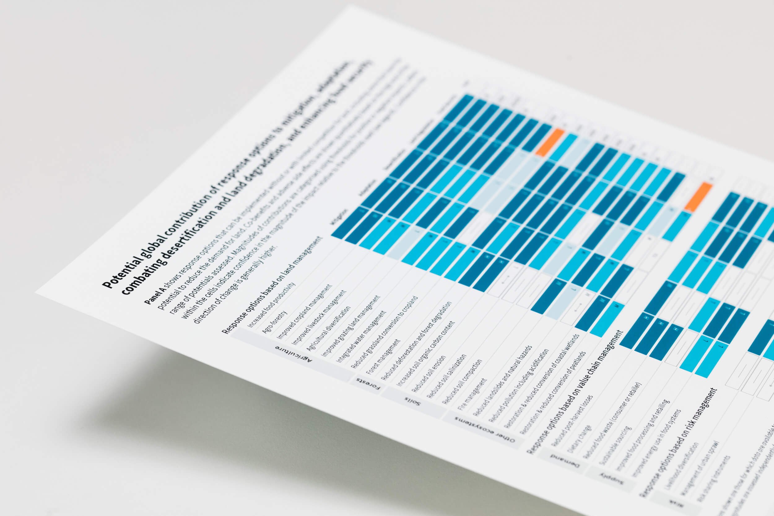
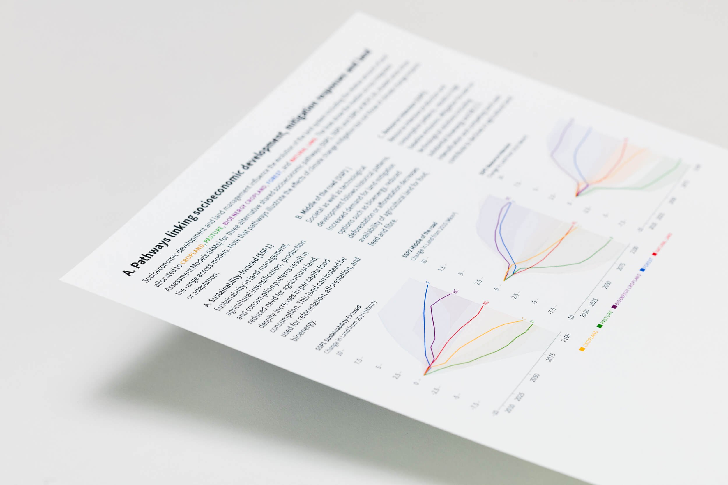
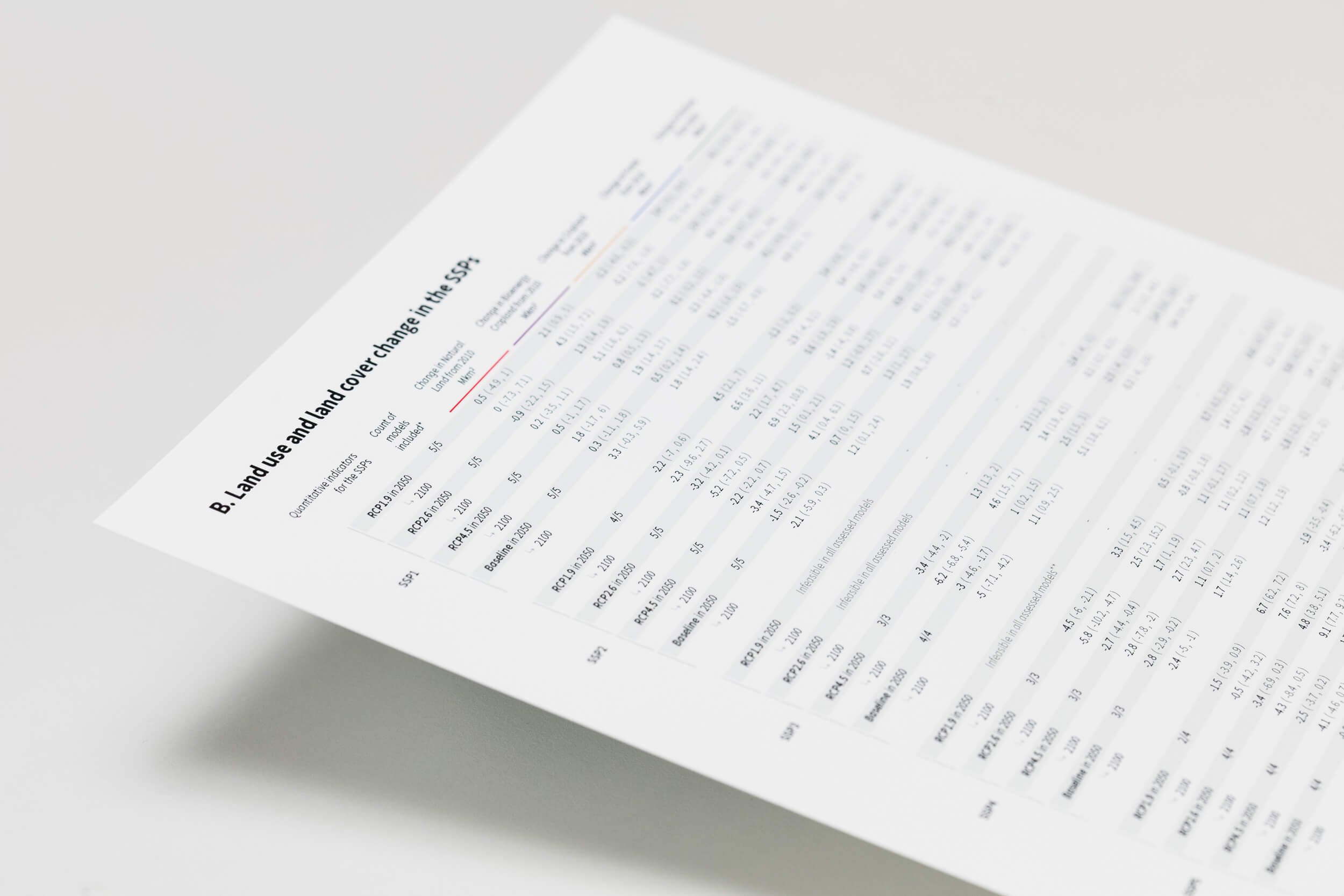
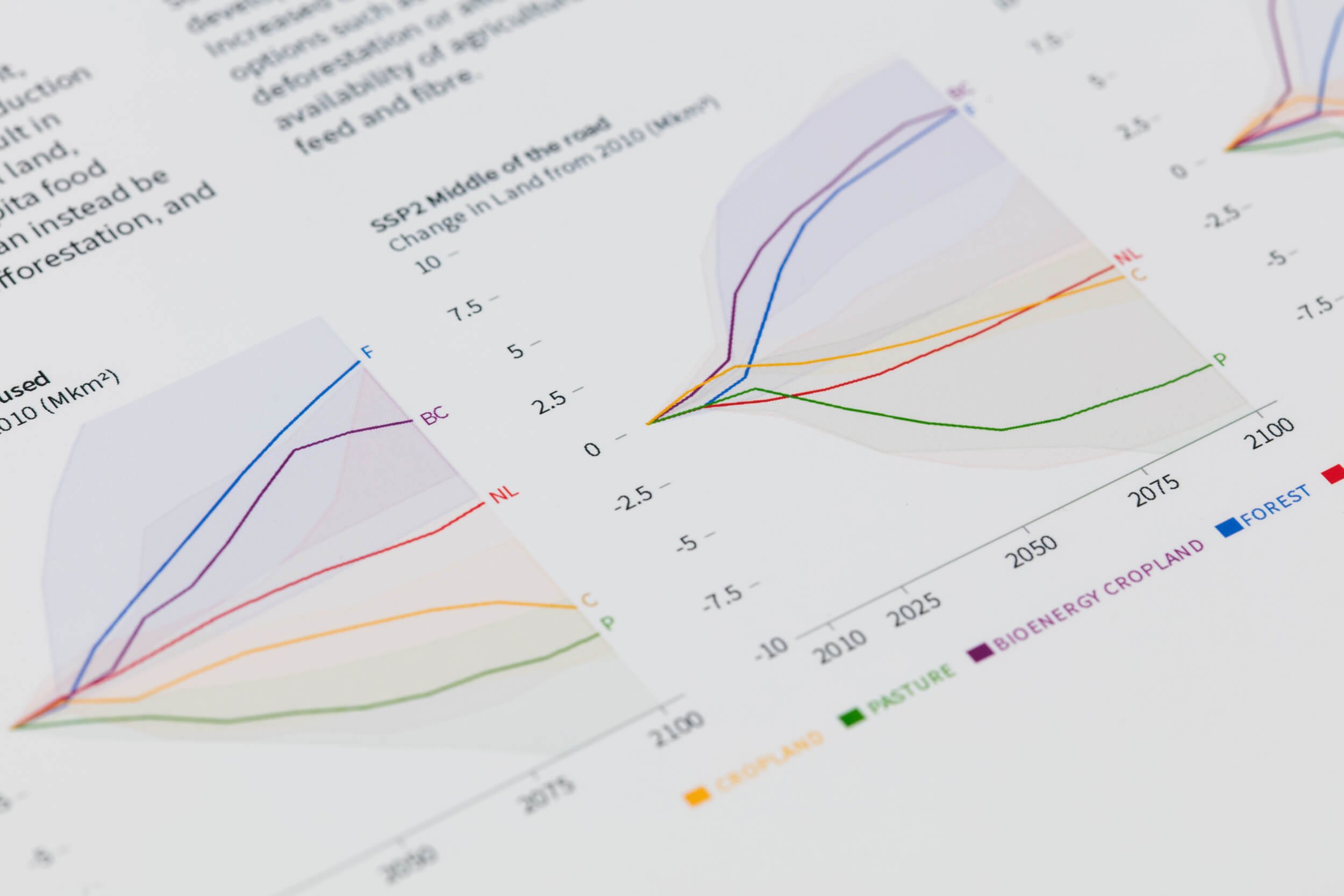
2. The IPCC Special Report on Climate Change and Land
Working closely with the scientist authors, the WGIII Technical Support Unit (TSU) and all six Working Group Co-Chairs over several months, we were thrilled to be commissioned a second time by the IPCC to produce the graphics for the Summary for Policymakers of the Special Report on Climate Change and Land (SRCCL).

Drawing on our experience of the Special Report on 1.5°C, our co-design process incorporated many of the same structural elements, including design meetings (in-person and remote); guiding authors to think about key messages; and incorporating internal feedback and formal review comments in a series of iterations.
Building on the lessons learnt during the co-design process for the 1.5°C report, we had a better collective understanding of how important it was to make sure authors and everybody involved in the process focused on the ‘intent’ of the figure before moving ahead to the design. This had a big impact on the narrative of each figure, the narrative across figures and, critically, discussions during the approval negotiations.
Our specific outputs for the Special Report on Climate Change and Land included: co-designing six key SPM figures; real-time editing at the approval session in August 2019 (including one figure being designed completely from scratch on-site); and delivery of the approved visuals in formats appropriate for online, download and public outreach. We are grateful to the Working Group III Technical Support Unit for formally acknowledging InfoDesignLab’s contribution by listing us as drafting authors of the final SPM.
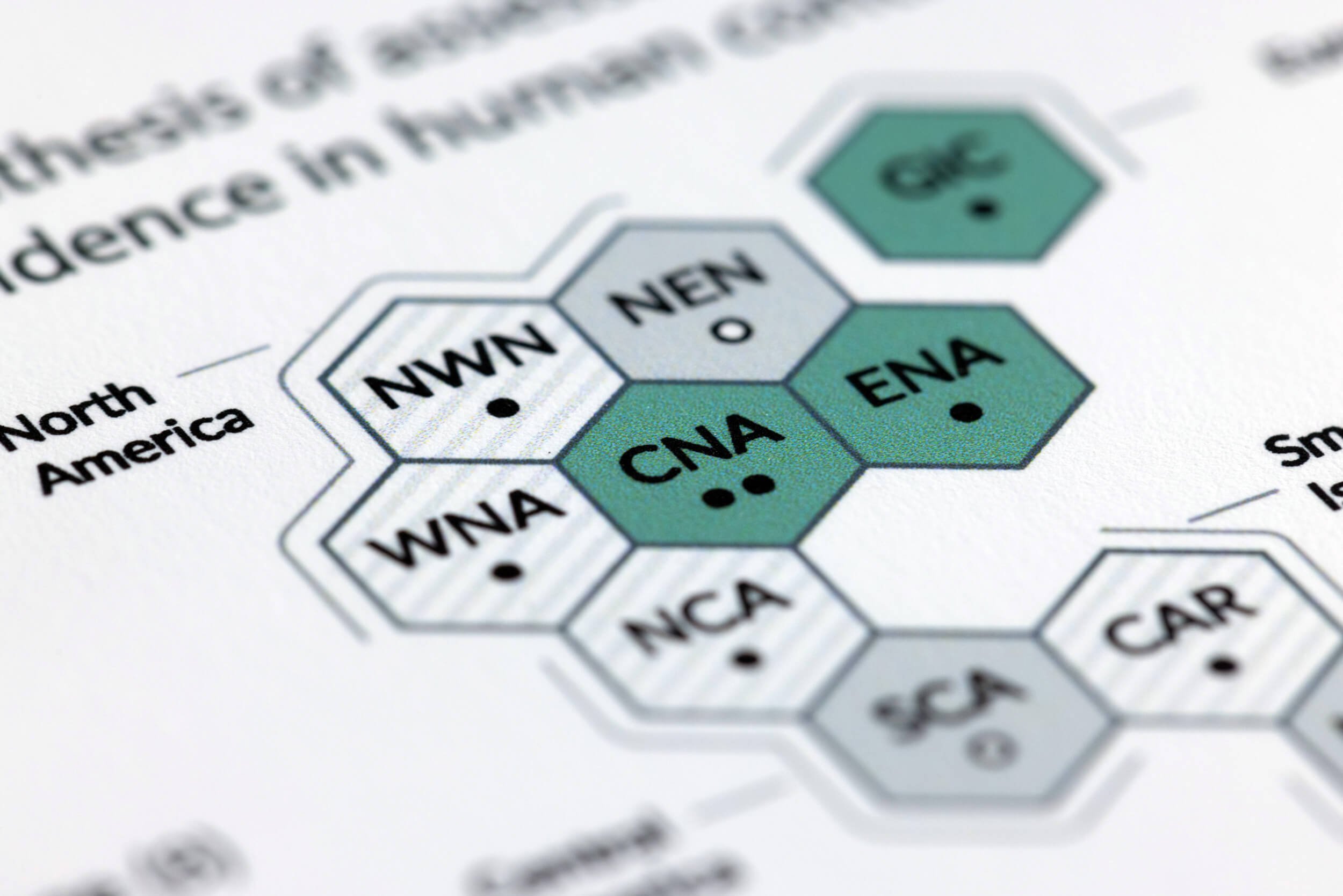
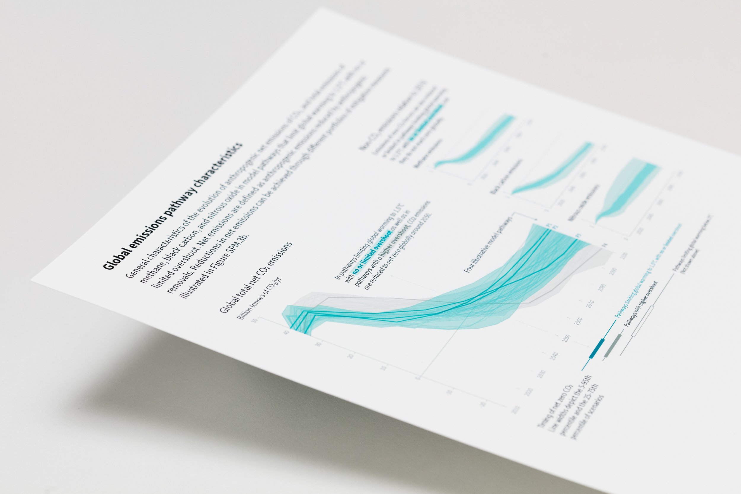
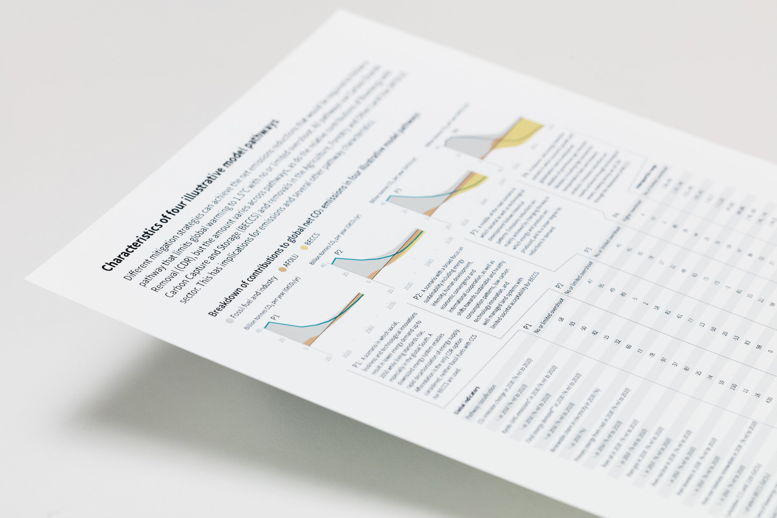
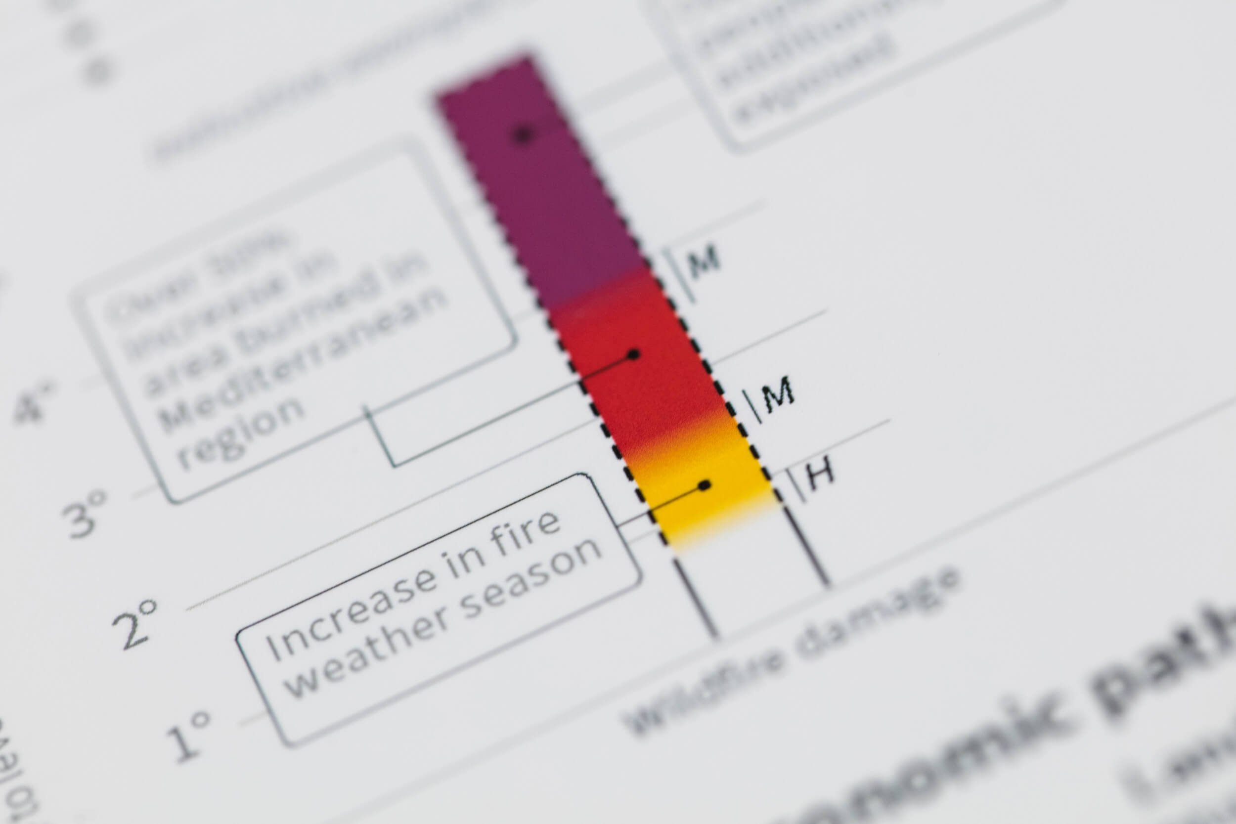
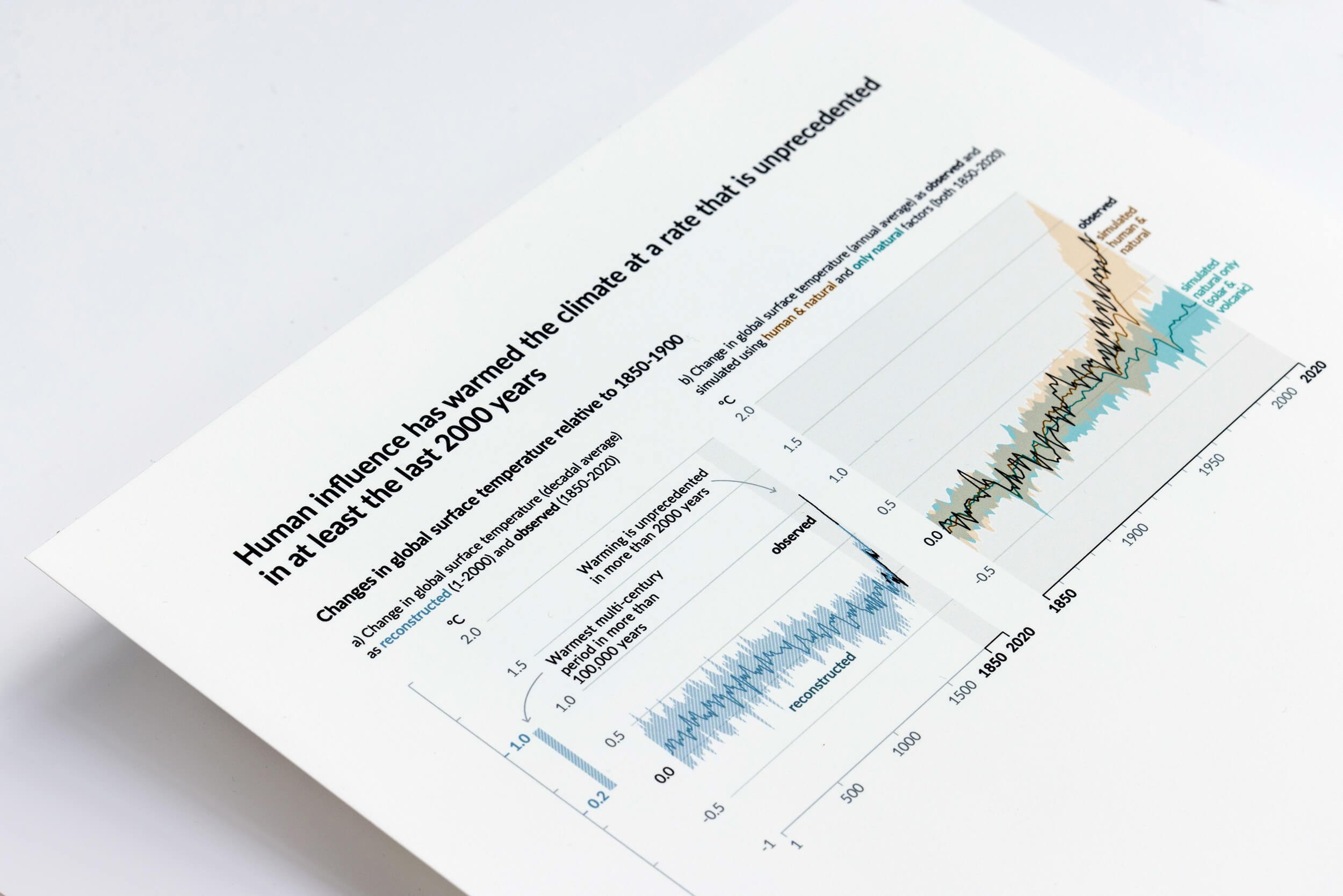
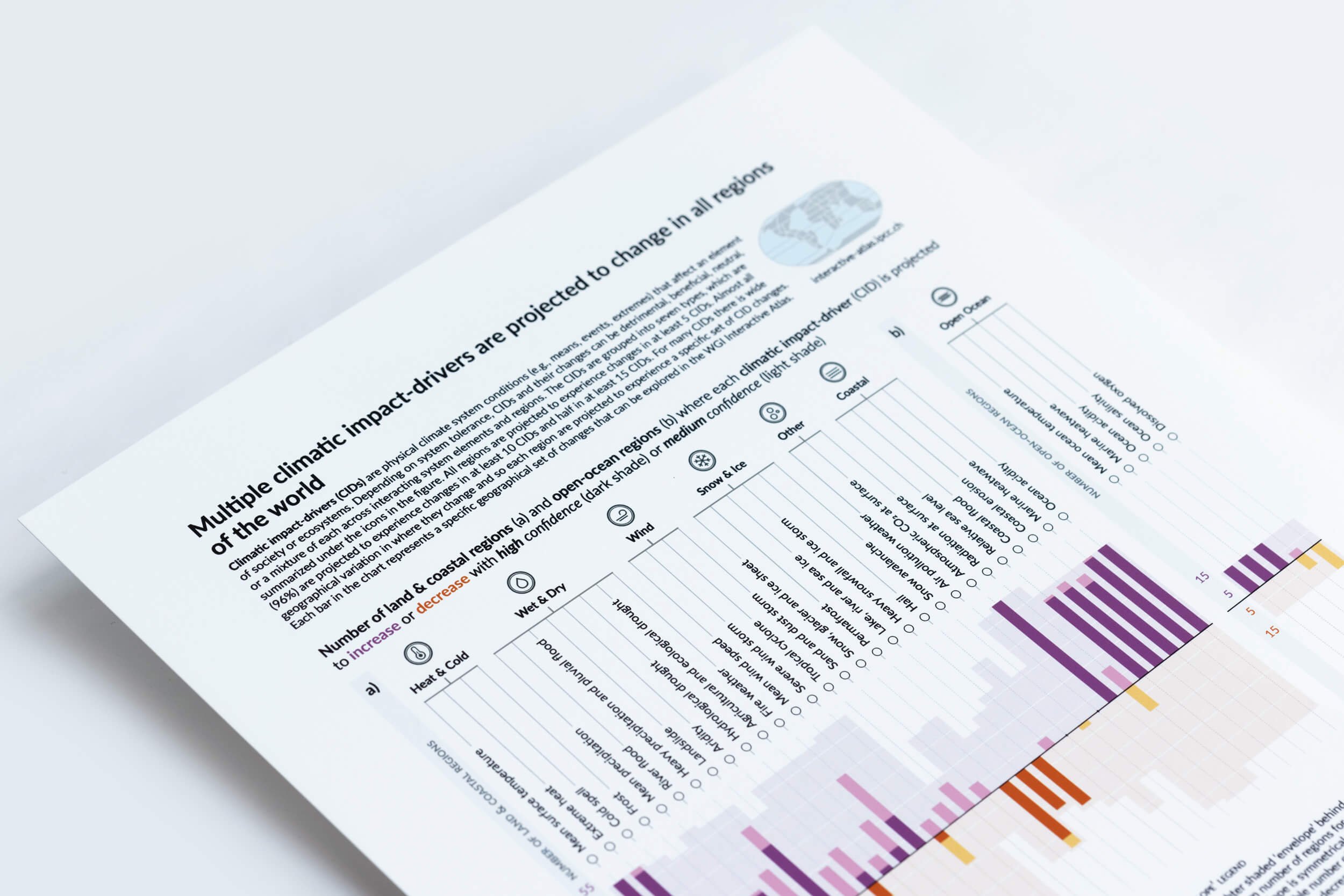
3. The Working Group I contribution to the AR6 cycle: The Physical Science Basis
The experience of the special reports indicates a shift towards a design culture that recognises the value of telling a compelling visual story while retaining scientific integrity — an approach that has been retained for the summary for policymakers of the Working Group I contribution to the Sixth Assessment Report, The Physical Science Basis.
The full report has been drafted by 234 authors from 65 countries. Authors reviewed a massive body of scientific work, the report has 14,000 cited references to the scientific literature. The summary for policymakers of this report includes a suite of ten data visualisations that have been carefully co-designed over a period of 18 months implementing a human-centered approach to the data visualisation process.
The global audience for the report The Physical Science Basis has been extremely broad: 3.3 million is the estimated number of people who shared or got engaged with the content of the report in the first weeks after the launch.
The digital narrative Climate Change in Data is building on and expanding the outreach of the report, by employing engaging visuals, interactive elements, and a layered approach to storytelling. The narrative offers a compelling and accessible medium for communicating complex scientific concepts to a wider range of audiences.

Read more about the collaboration with The Intergovernmental Panel on Climate Change:
Springer Nature, Co-designing engaging and accessible data visualisations: a case study of the IPCC reports, as part of a collection called Climate Change Communication and the IPCC
Nightingale, Communicating Climate Risk: Insights from the IPCC Information Design Team
Medium, Designing for Tuesday