Scientific American, Safe and Just Boundaries
The work for Scientific American, a magazine that covers the most important research, ideas and knowledge in science, health, technology, the environment and society. Founded in 1845, it is committed to sharing trustworthy knowledge, enhancing our understanding of the world, and advancing social justice.

How it all started
Our first encounter with Jen Christiansen, science communicator, author, and editor at Scientific American, happened when she requested a brief interview about collaborative design in the space of data visualisation for science, for her book Building Science Graphics.
Collaboration, systems-oriented design and participation within visualising science have been very central to the work we have done with scientists over the past two decades, and discussing the co-design process, along with its challenges and discoveries, was a moment for reflection. We said goodbye on that occasion with a wish to collaborate on a piece for Scientific American one day.
On December 6, 2023, we received an email from Jen asking, ‘Available for a Scientific American project?’. Planetary boundaries and climate justice would be the content space, a piece of science so close to our hearts and a perfect opportunity to kickstart the collaboration.
Jen was offering the opportunity to work on a graphic spread accompanying an article written by Prof. Joyeeta Gupta, co-chair of the Earth Commission set up by Future Earth and supported by the Global Challenges Foundation, together with Johan Rockström and Dahe Qin.
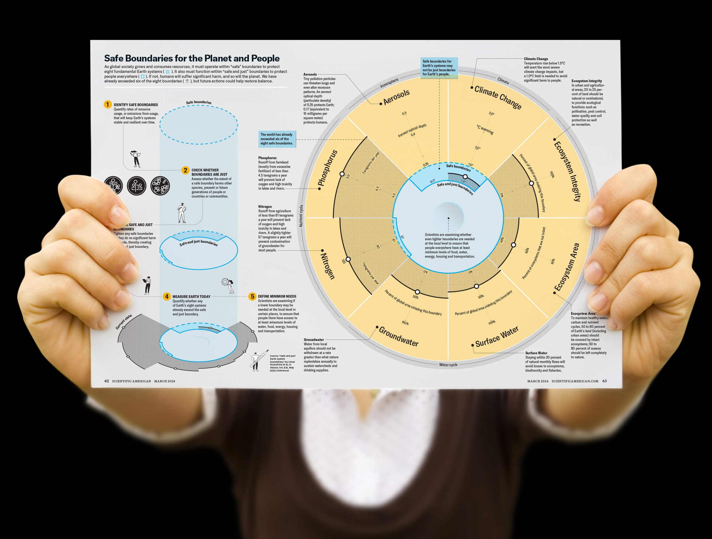
The context for the article was that in 2009 an international group of scientists famously determined that society had to stay within nine numerical “planetary boundaries” to preserve all of Earth’s vital systems. In 2023 a new group of scientists revised those boundaries so that they also keep people safe from harm and do so in a way that provides environmental justice worldwide. The purpose of the graphic spread would be to create a visual narrative to convey the results of the new assessment. We would collaborate closely with Jen, a small team of scientists, and reviewers, alongside Jen’s colleague, Mark Fischetti, senior editor at Scientific American.
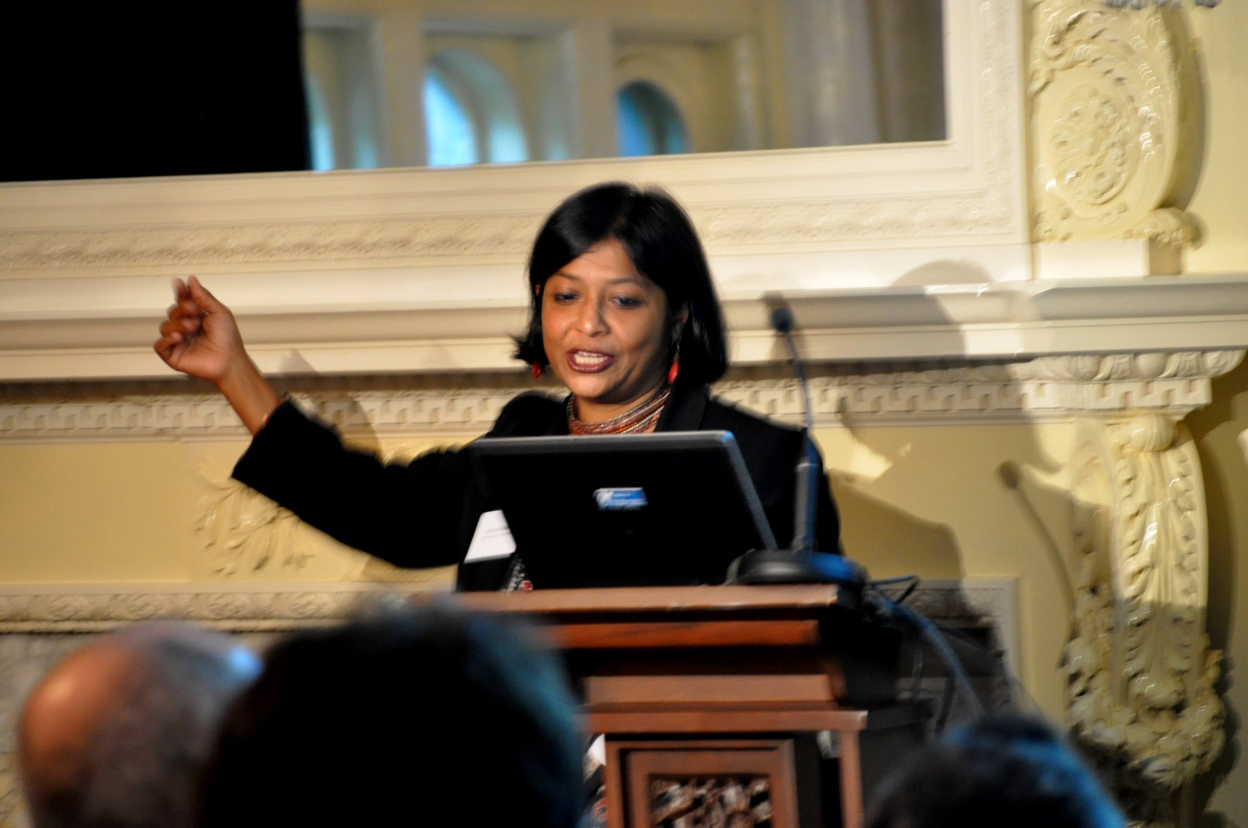
Prof. Joyeeta Gupta, Photo credit: Pardee School of Global Study
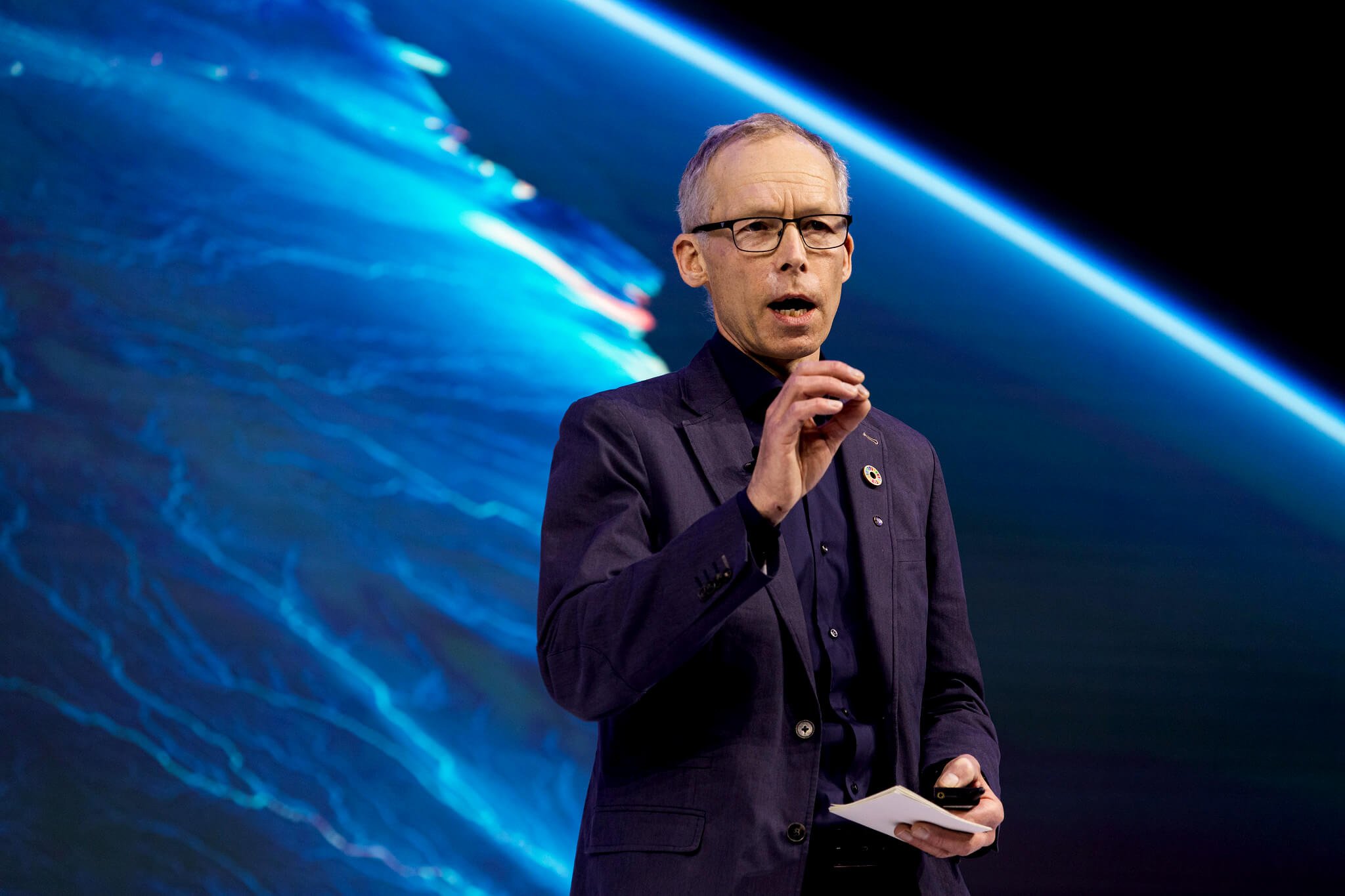
Prof. Johan Rockström, Photo credit: World Economic Forum

Jen Christiansen, American author and editor at Scientific American
The three gates of the design process
Regardless of a project's scale, length, and the number of people involved, research, intent, and user inclusion are gates that will always be crossed in every project we work on. These gates are not necessarily sequential; they can involve different people along the journey and can be crossed multiple times.
The research
The deadline was tight, but the dedication of the Scientific American team and the responsiveness of the scientists in answering several iterations of questions have been impressive. This allowed us to dive into the content in a really thorough way, appreciating the wealth of information, understanding the weight of the data, and acknowledging a body of scientific work that has evolved over fourteen years. We kickstarted the research phase with an article shared by Jen, published in Nature, titled "Safe and just Earth system boundaries," along with an initial draft written by Prof. Gupta for Scientific American that included the sketch for a visualisation of the Earth system boundaries.
We decided to dive not only into the evidence to understand the assessment and its dimensions, but also into the genesis and evolution of the visualisation. The radial plot that visualises the Earth's Planetary Boundaries is an iconic image conveying a groundbreaking assessment of how humans exploit the Earth’s resources. This visual has evolved over the years and has been adapted into different versions. An initial visual research made it apparent that we were standing on the shoulders of giants, with a visual history that could not be disregarded, showing how content and visualisation had evolved hand in hand. It was enlightening to dive into readings such as A Dashboard for Planet Earth by Duncan Geere, A Doughnut for the Anthropocene: humanity's compass in the 21st century by Kate Raworth and the Cautionary Remarks on the Planetary Boundary by Miguel D. Mahecha and Guido Kraemer, to name a few. As is always the case, the power of research lies in making us aware of the depth of the science, the dimensions of the assessment, the rigour and challenges, and the magnitude of the scientists' journey.
We see every project not only as an opportunity to visualise the findings, but also as a chance to highlight the scientists' process behind the assessment. We started thinking about a visual narrative that would provide not only a visualisation of the evidence but also an understanding of how the scientists arrived at their assessment, with a focus on the criteria of justice that are central to the Earth System Boundaries.


The intent
The interactions with Jen and the scientists helped us answer many questions and define a very clear intent for the narrative: safe boundaries for Earth’s systems may not be just boundaries for Earth’s people, meaning that justice considerations can lead to more stringent boundaries than safety (biophysical) considerations.
We worked to get the intent across by visualising:
The safe boundaries: as global society grows and consumes resources, it must operate within “safe” boundaries to protect eight fundamental Earth systems.
The safe and just boundaries: society also must function within “safe and just” boundaries to protect people everywhere, if not, humans will suffer significant harm, and so will the planet.
Where we are now: we have already exceeded the safe and just limits for six of the eight boundaries, but future actions could help restore balance.
We decided to enrich the narrative with two extra atoms:
one illustrating the behind-the-scenes efforts that underpin the scientists' assessments,
and another providing a detailed look into the justice criteria, offering a sneak peek into the incredible wealth of knowledge on which the assessment is based.

The user inclusion
Jen’s extraordinary design skills and her elegance in handling communications, feedback, support, and suggestions have been important in such a short and high-paced collaboration, helping us to thoroughly understand the target audience and their needs.
The involvement of Scientific American reviewers and the light user testing we conducted internally guided our decisions on narrative structure, color, and clarity of intent. The inclusion of readers helped us ensure that we could align with their needs and expectations as much as possible.
_ _ _
Link to the final article (paywall): https://www.scientificamerican.com/article/how-to-protect-people-while-preserving-resources/
